Layouts
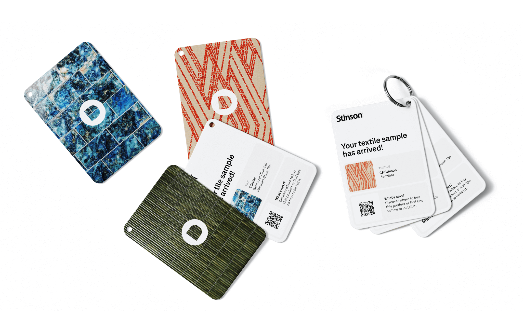
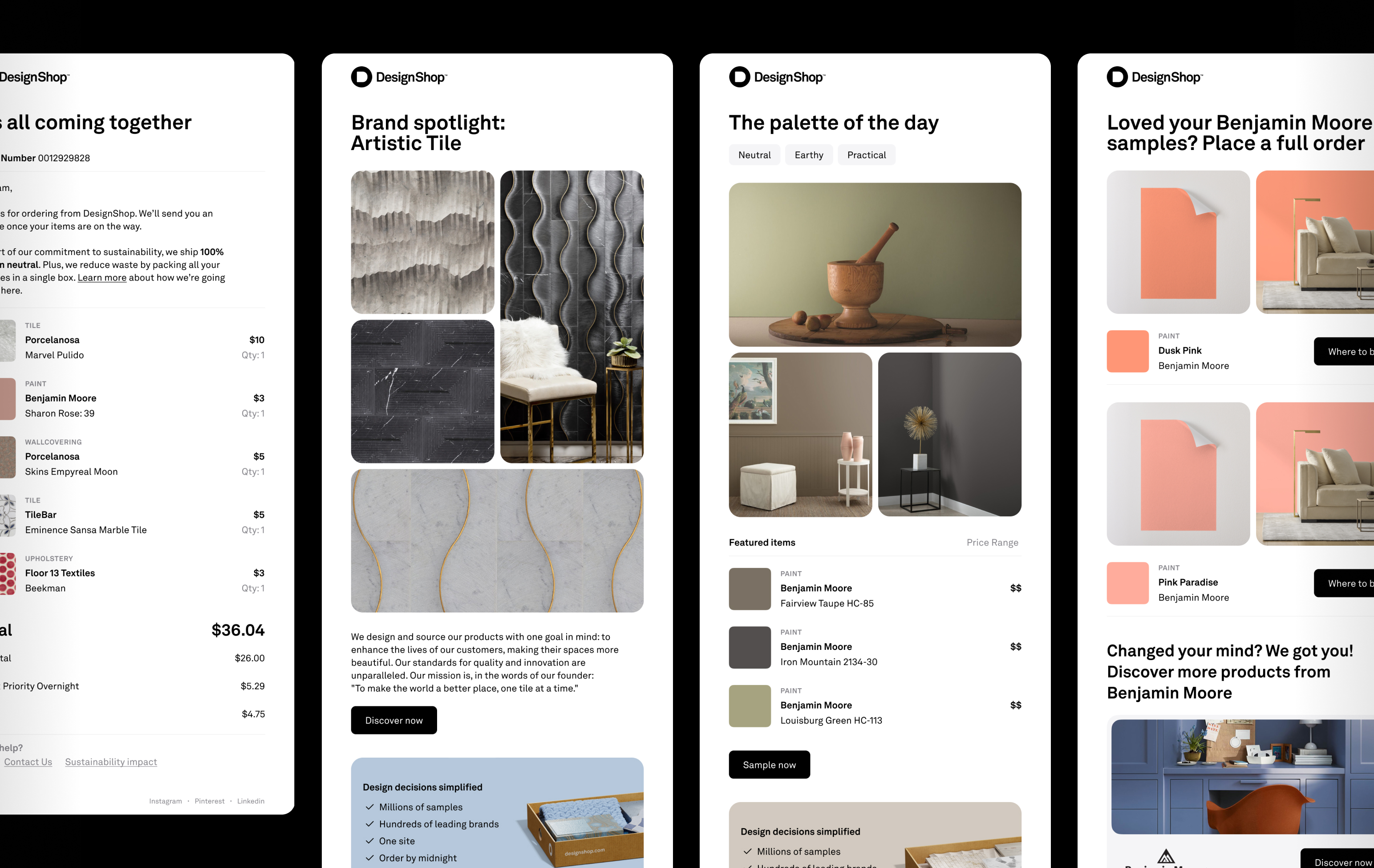
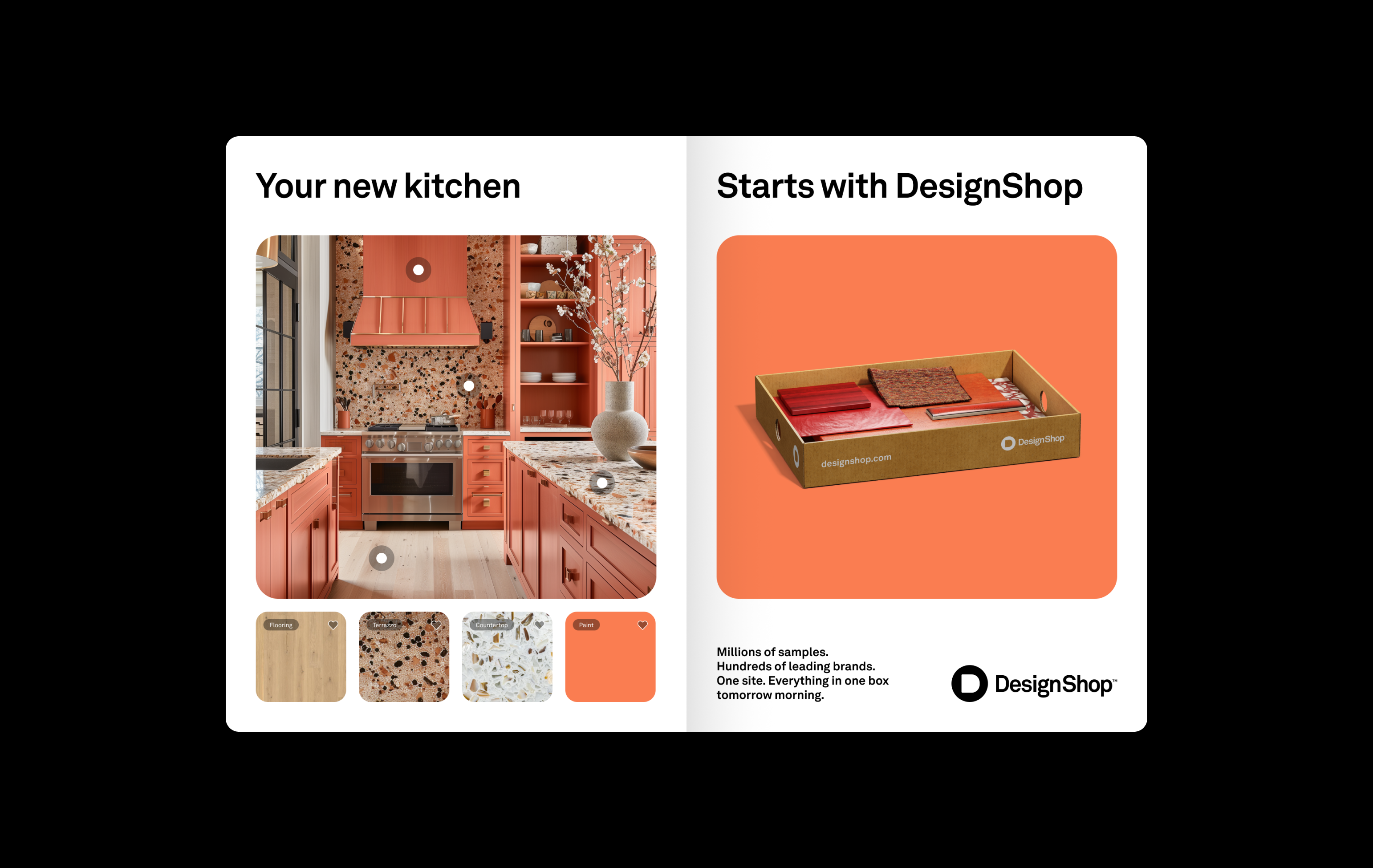
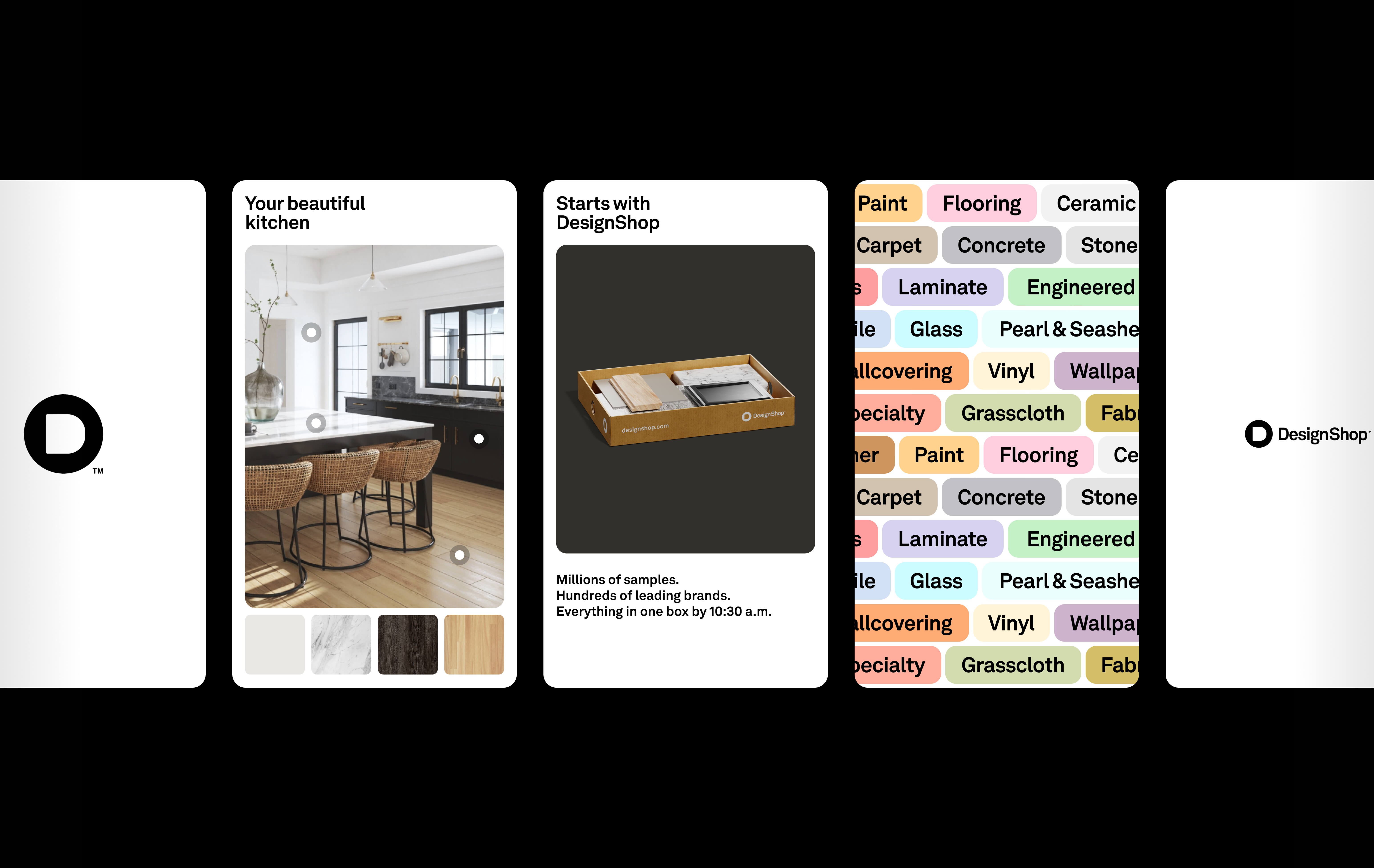
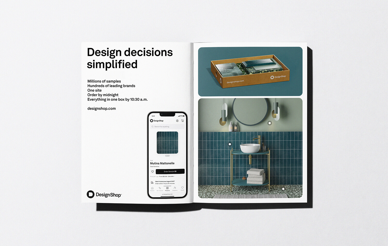
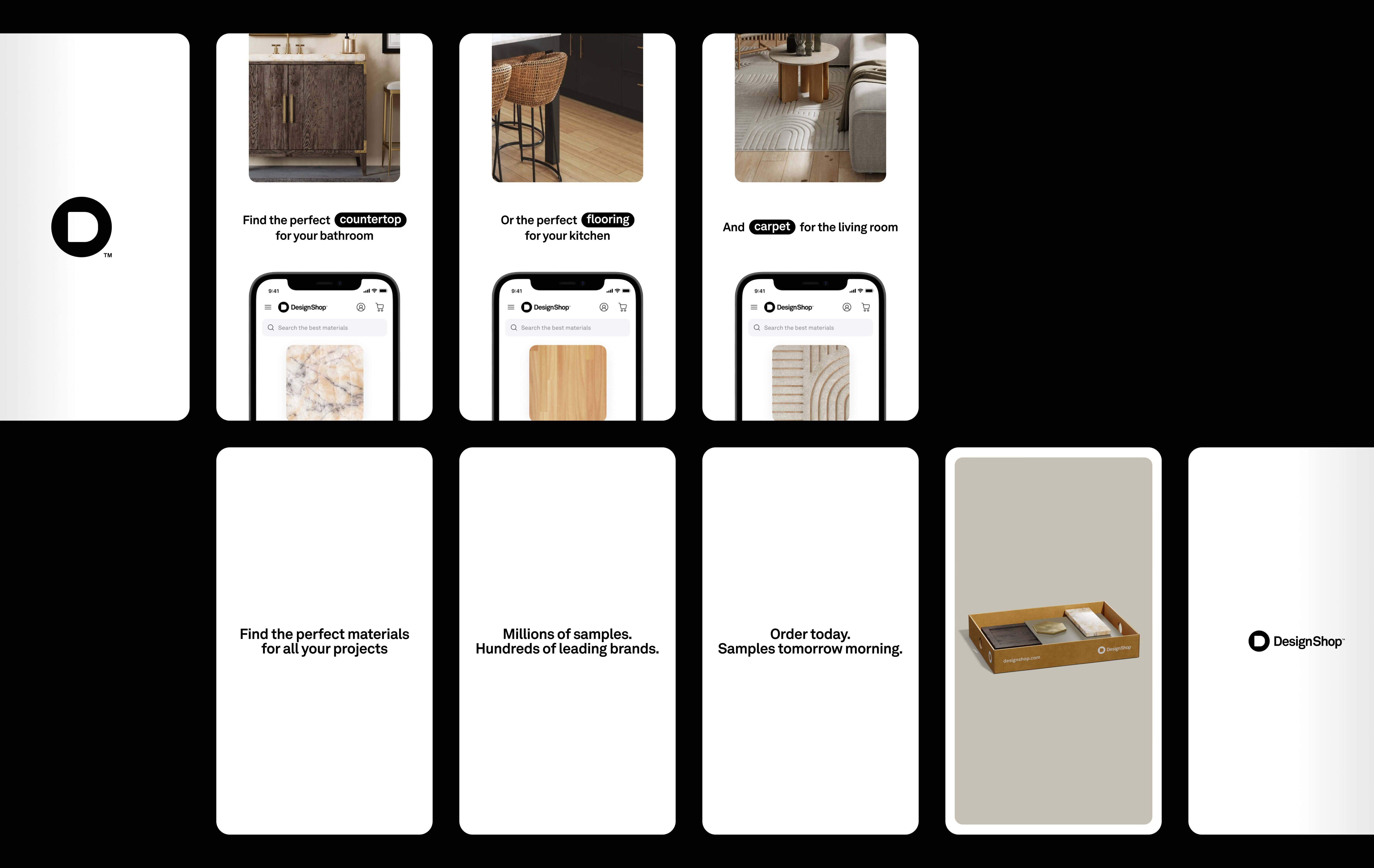
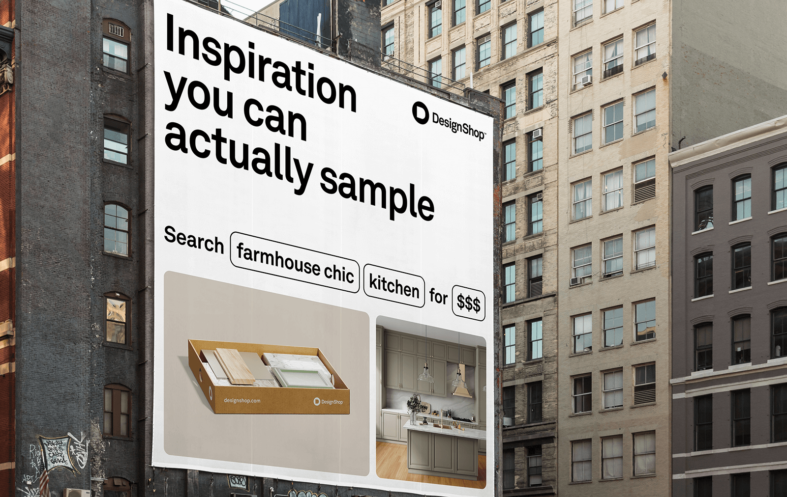
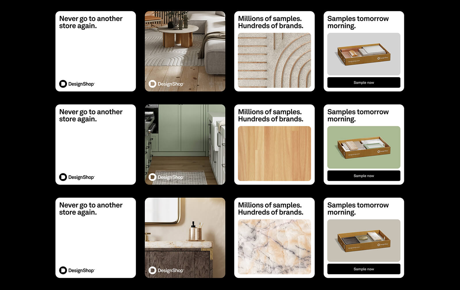
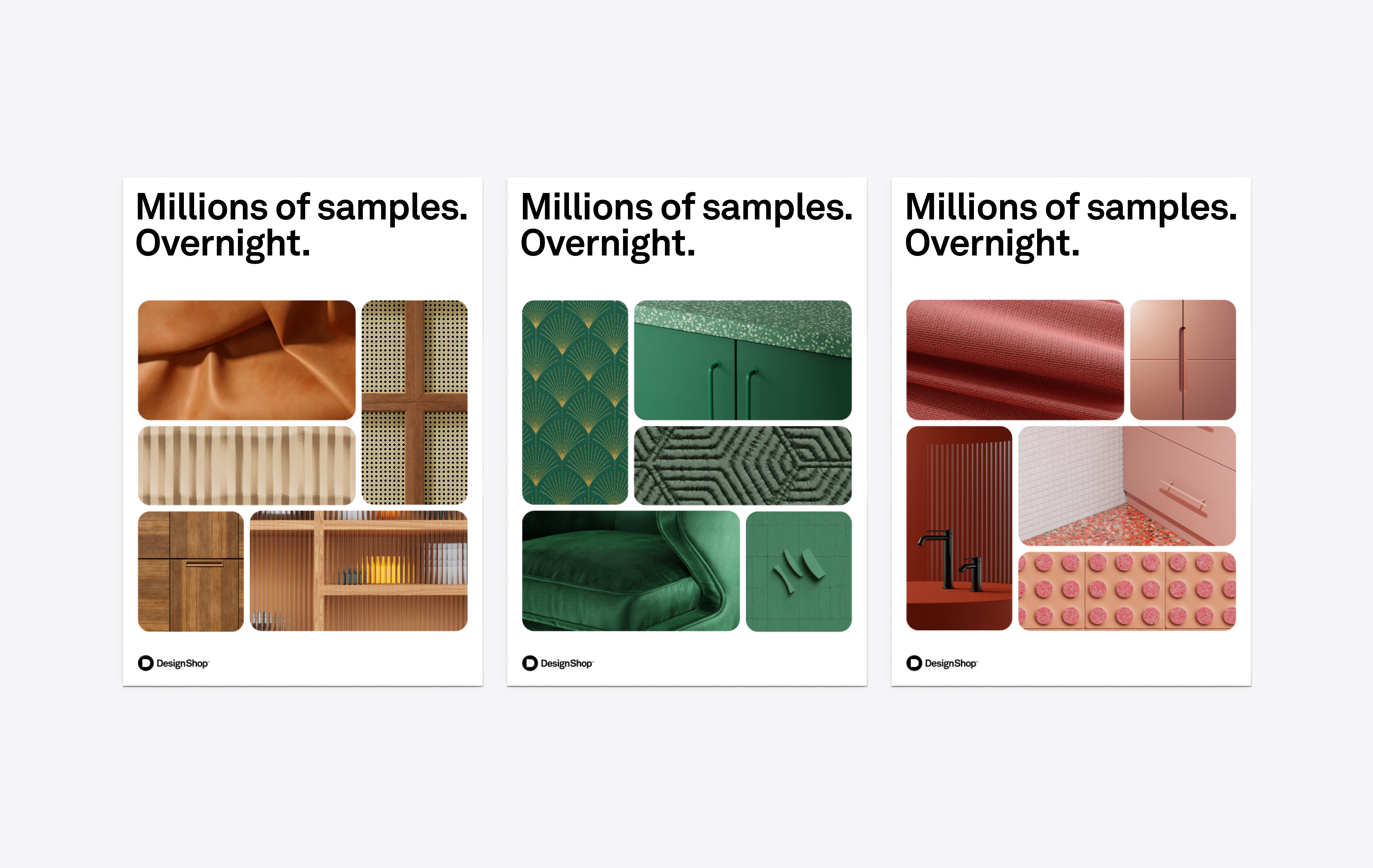
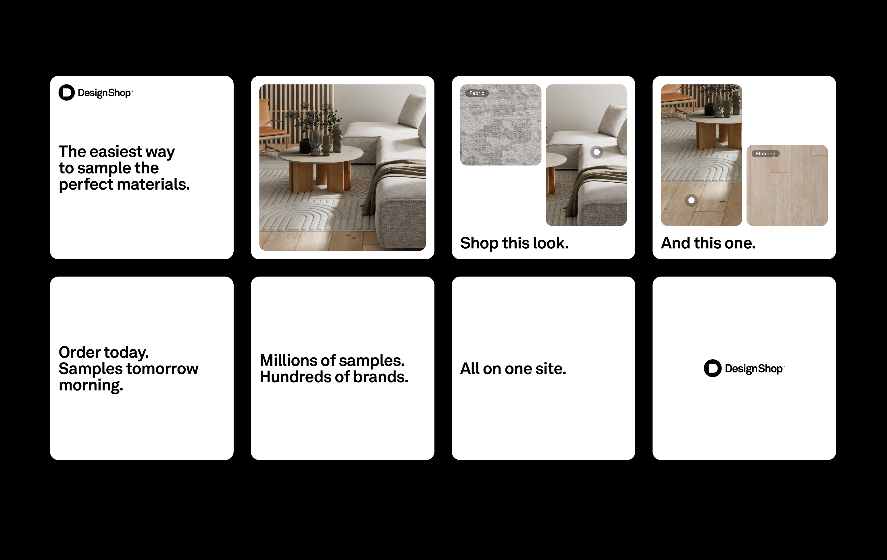
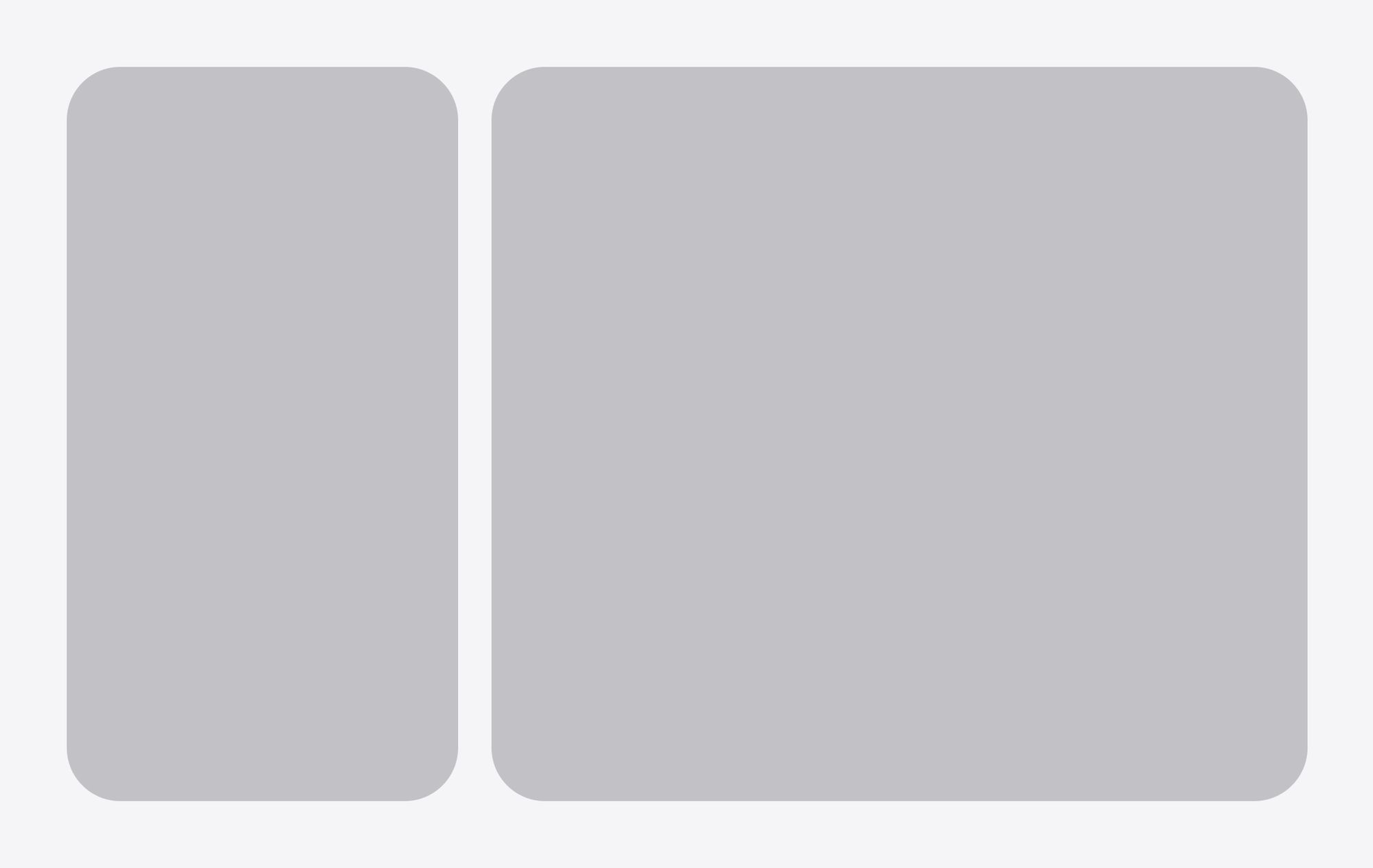
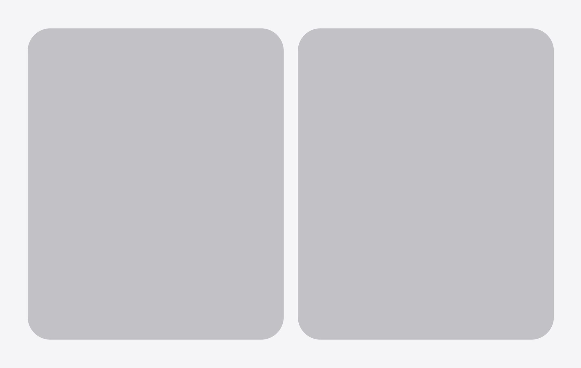
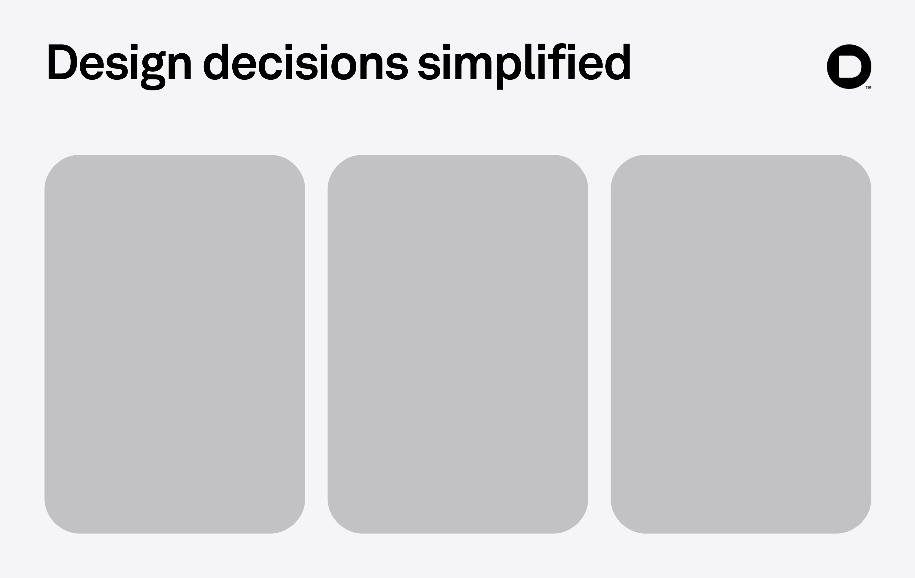
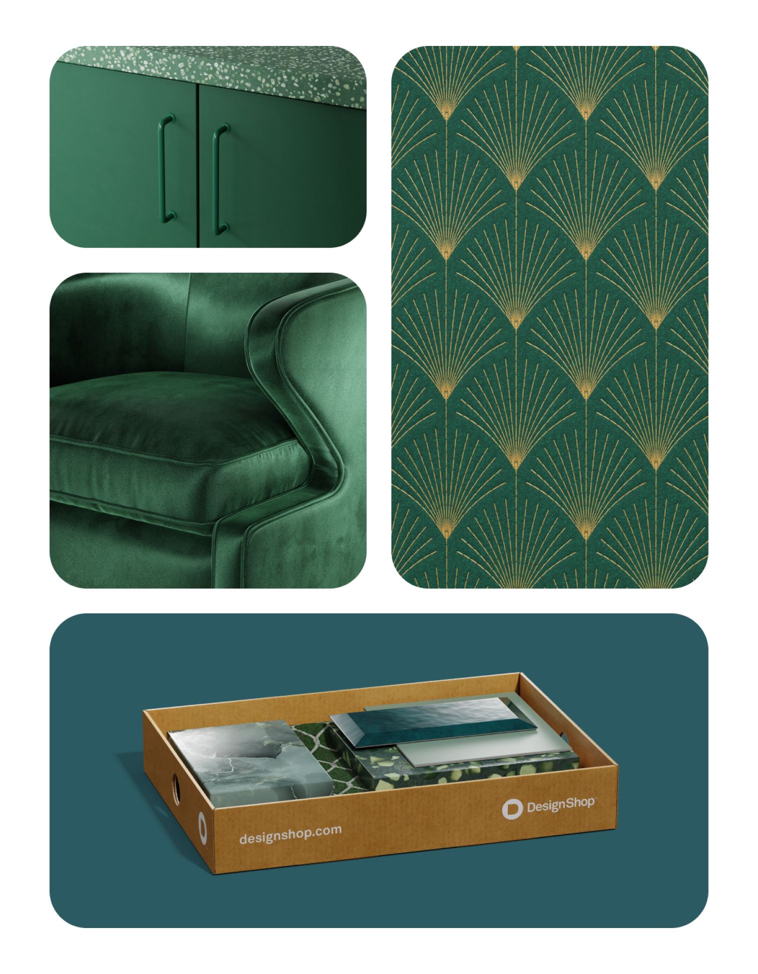
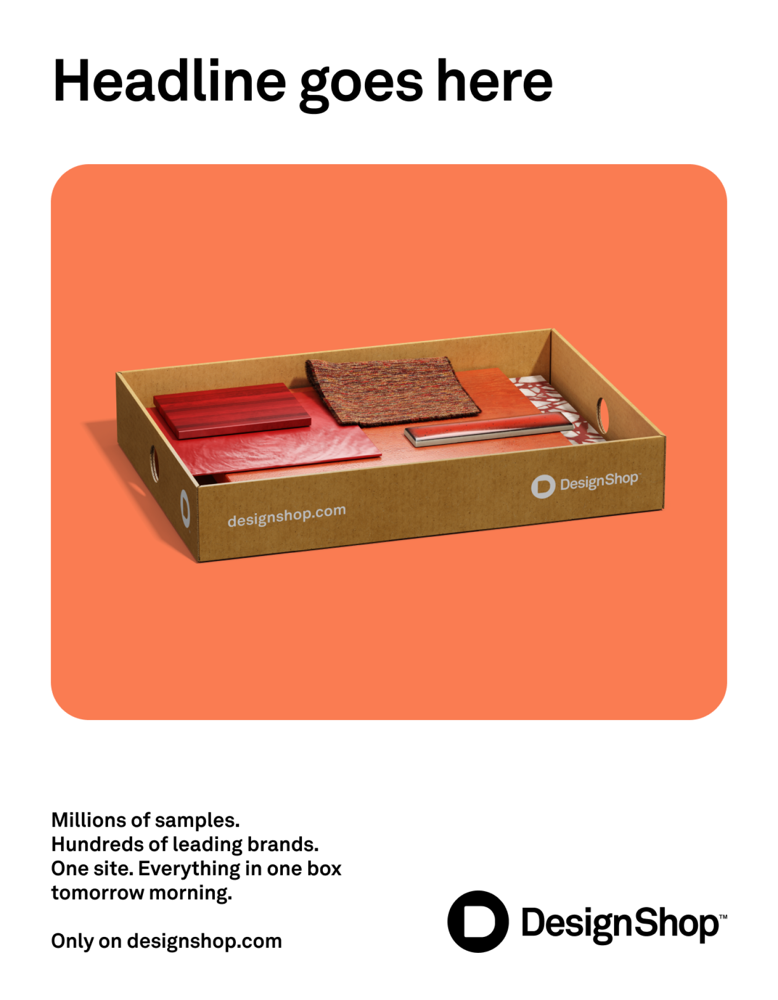
The layout system keeps product samples front and center. Our work should complement this photography, giving pride of place to the colors and textures our customers are looking for. We use a gridded, modular system that varies depending on the number of columns on a page.

Overview
For further information, please refer to the details below.

General rules
Margins
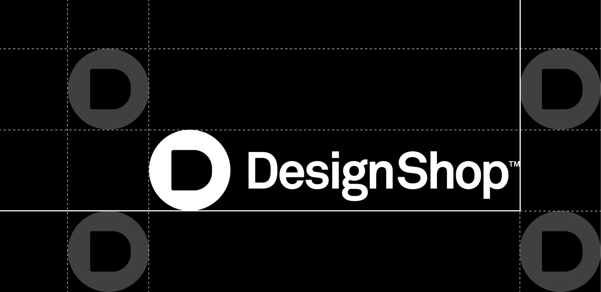
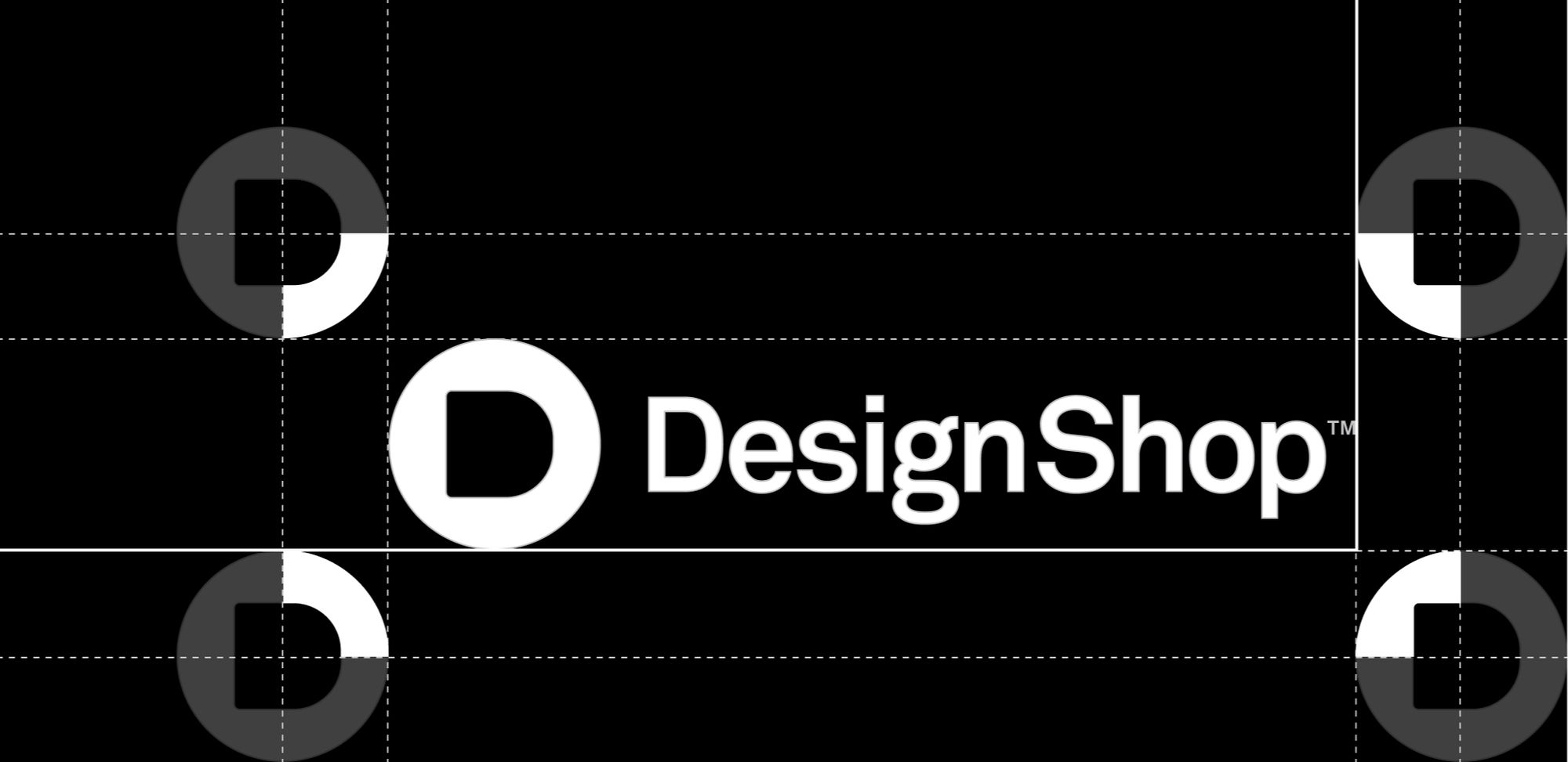
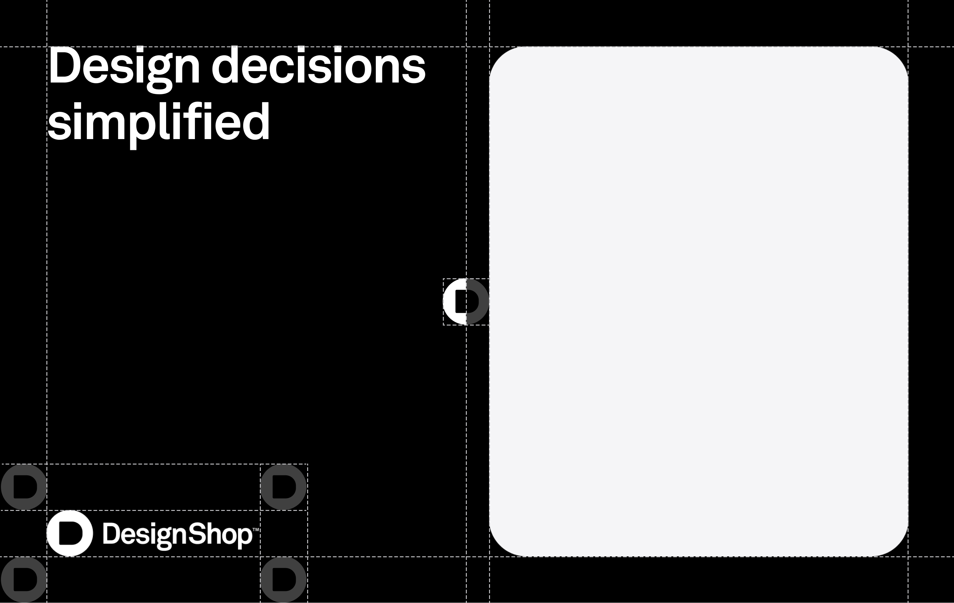
Margins are defined by the size and clear space of our logo. When using the smaller logo, the margin becomes narrower. When using the larger logo, the margin grows in size. This helps keep compositions proportional and consistent across the brand.
General rules
Corner radius
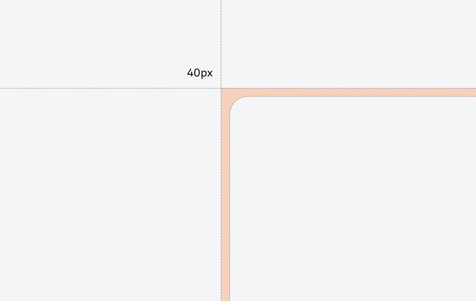
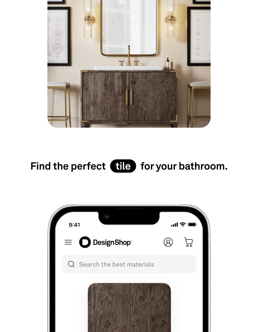
The corner radius plays a crucial role in constructing layouts, whether they involve colored shapes or placeholders for photography, as it ensures brand consistency. For smaller applications such as social media, digital and print ads, please use a corner radius of 20px. For larger applications like out-of-home (OOH) ads or banners, please use a corner radius of 40px.
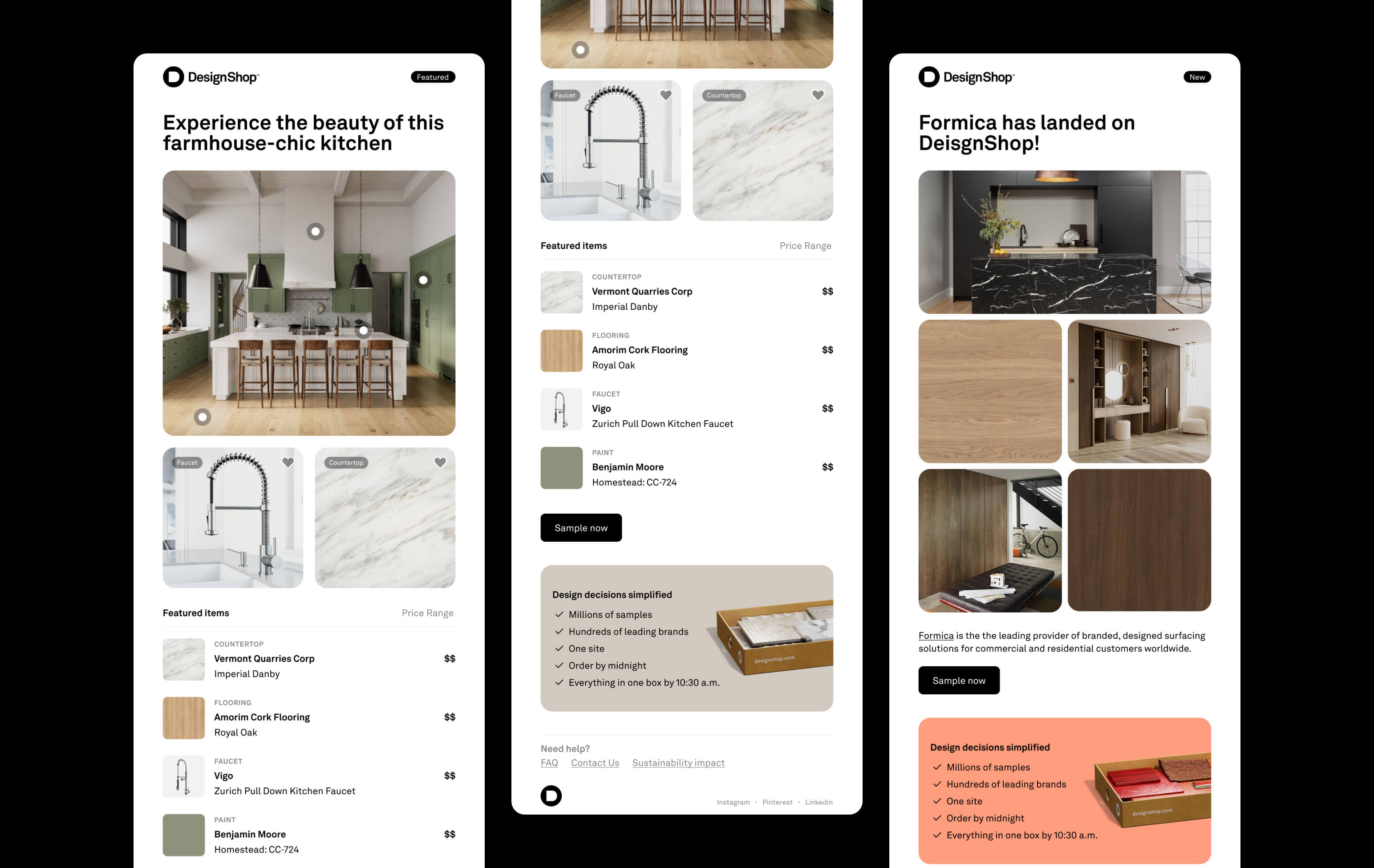
Application examples
