Color
Given our business, the DesignShop brand must be attentive to color. Please rely on Primary Colors in all applications, punctuating copy and graphics with Secondary Colors sparingly and meaningfully.
Core palette
Grayscale
Clean and authoritative, our Primary Colors include black, white, and different grays. This spare yet expressive palette ensures that our designs do not distract viewers from product photography.
White
G 255
B 255
M 0
Y 0
K 0
S 0
B 100
HEX #FFFFFF
PANTONE TBD
Light Gray 1
G 245
B 247
M 2
Y 1
K 0
S 0
B 96
HEX #F5F5F7
PANTONE TBD
Light Gray 2
G 242
B 242
M 2
Y 1
K 00
S 0
B 94
HEX #F2F2F2
PANTONE TBD
Light Gray 3
G 228
B 228
M 7
Y 7
K 0
S 1
B 77
HEX #E4E4E4
PANTONE TBD
Medium Gray 1
G 194
B 197
M 19
Y 17
K 0
S 1
B 77
HEX #C2C2C5
PANTONE TBD
Medium Gray 2
G 134
B 138
M 42
Y 39
K 4
S 2
B 54
HEX #86868A
PANTONE TBD
Medium Gray 2
G 51
B 51
M 63
Y 62
K 58
S 0
B 20
HEX #333333
PANTONE TBD
Black
G 0
B 0
M 68
Y 67
K 90
S 2
B 0
HEX #000000
PANTONE TBD
Core palette
Proportions
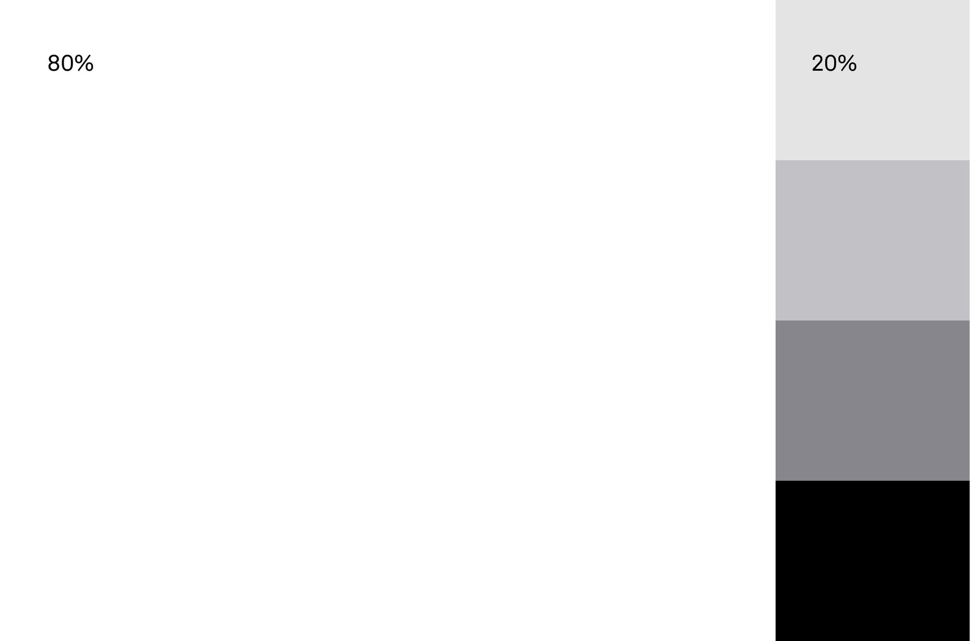
A color scheme predominantly composed of 80% white and complemented by 20% grayscale tones provides a clean, minimalist, and balanced visual aesthetic.
Application examples


Core palette
Materials
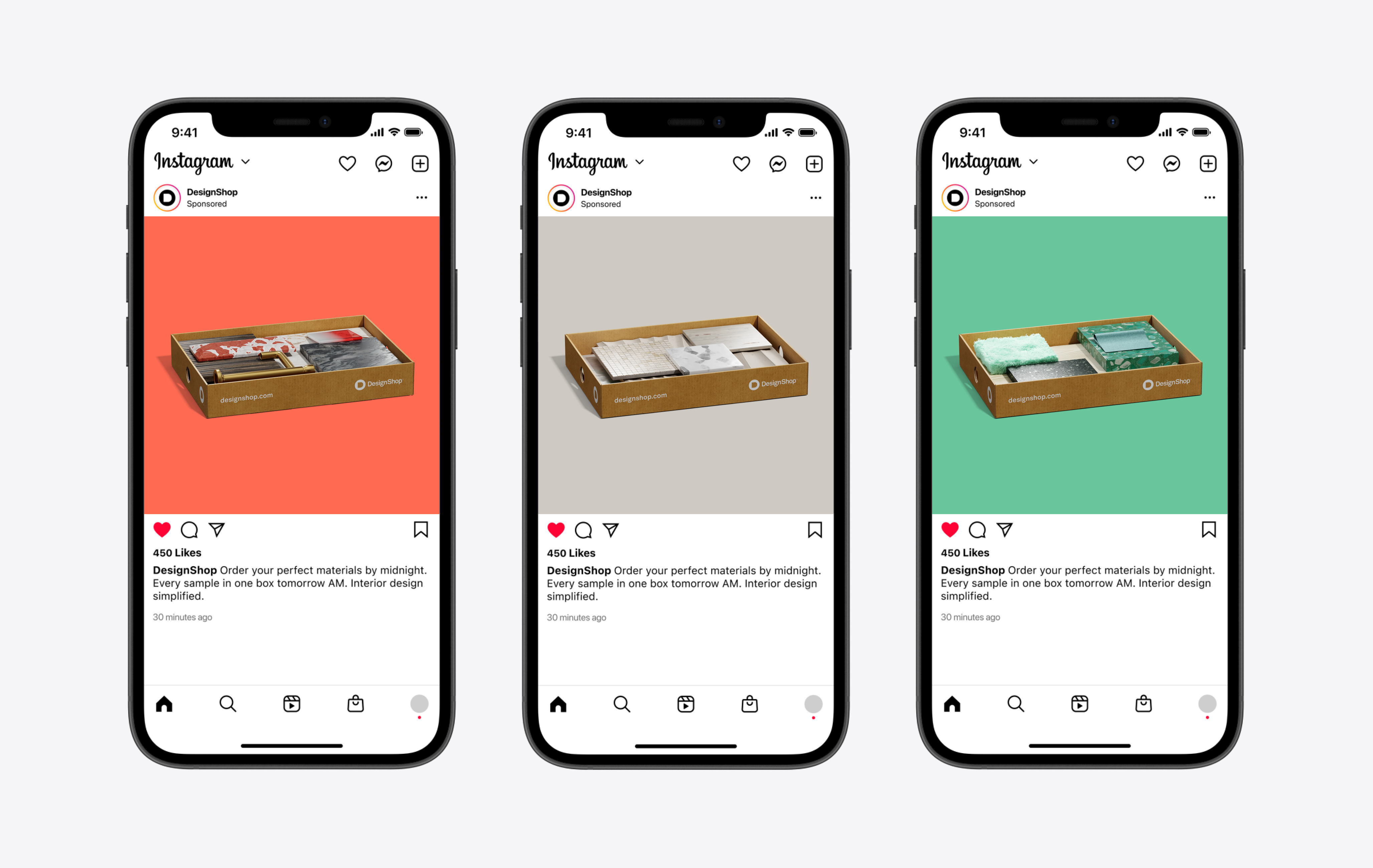
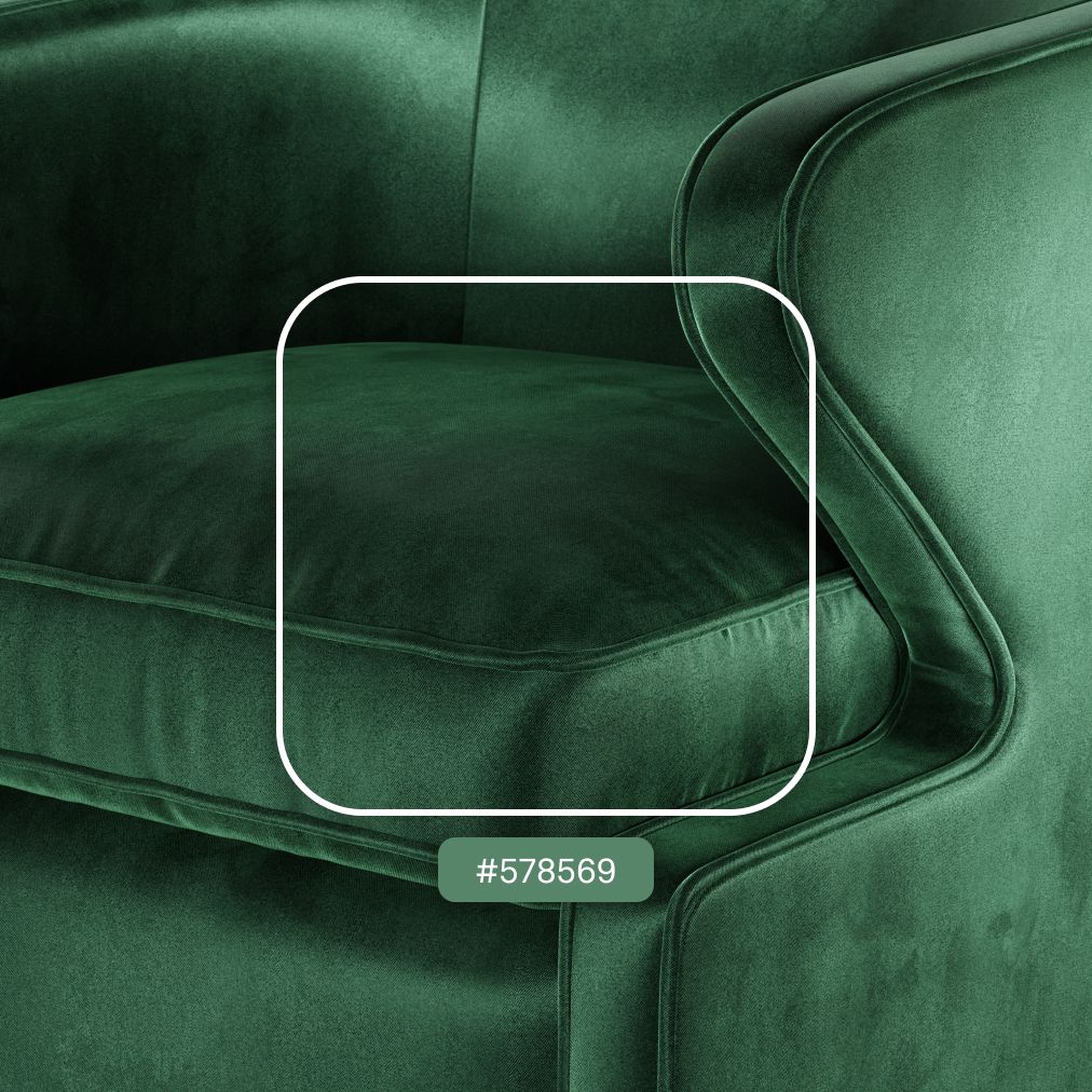
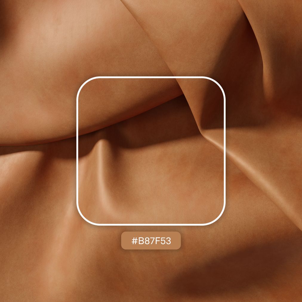
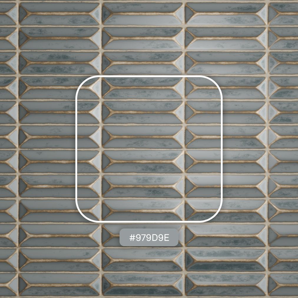
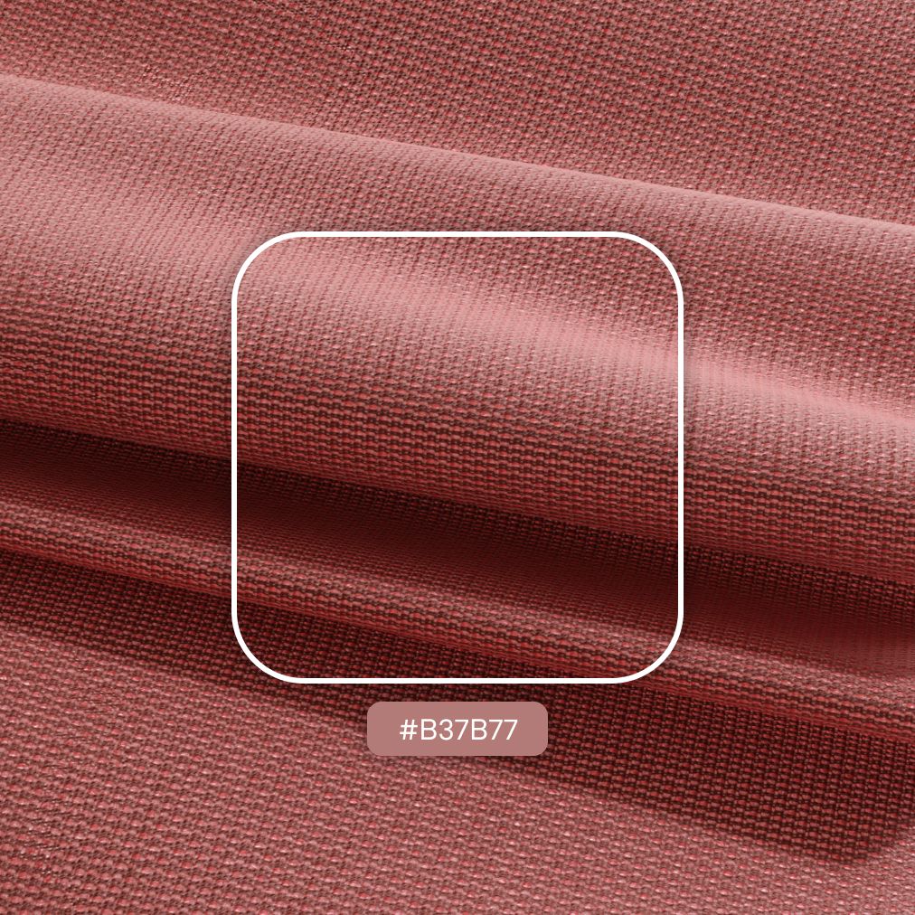
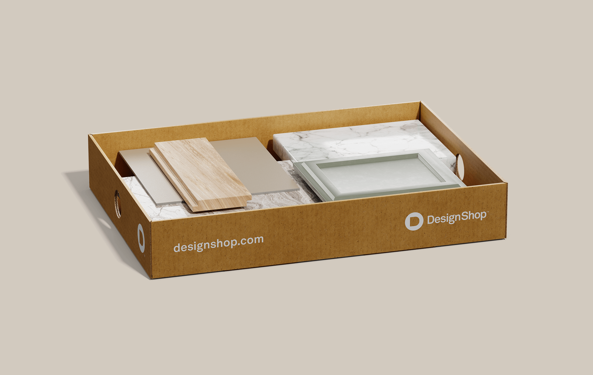
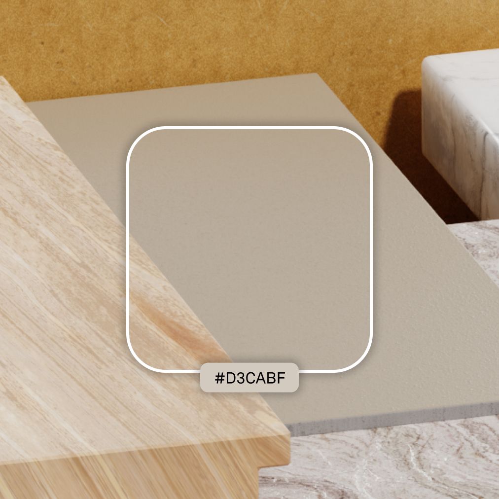
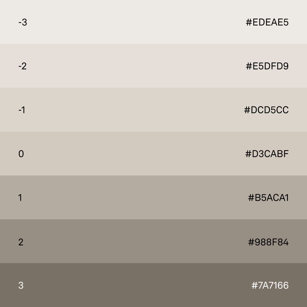
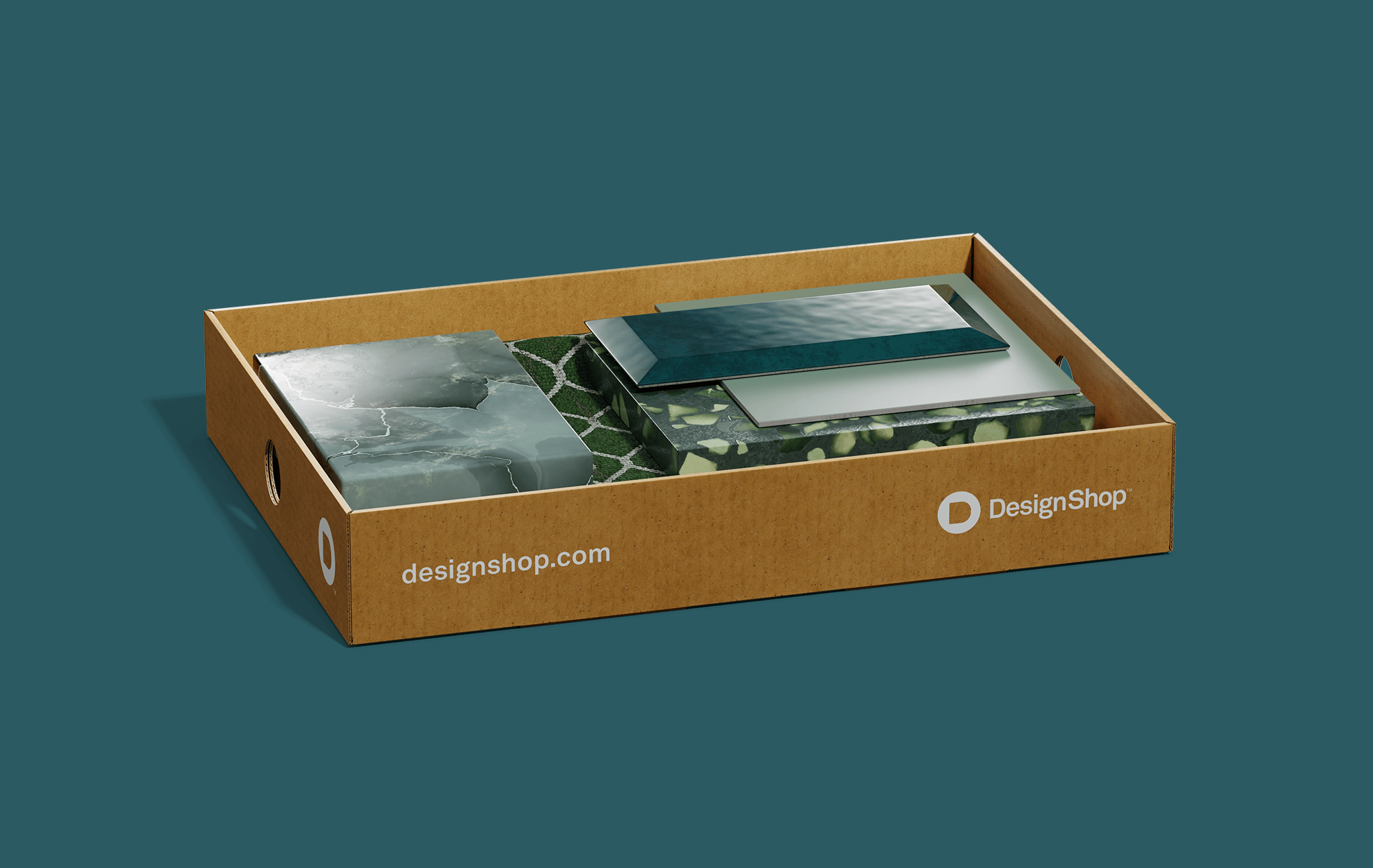
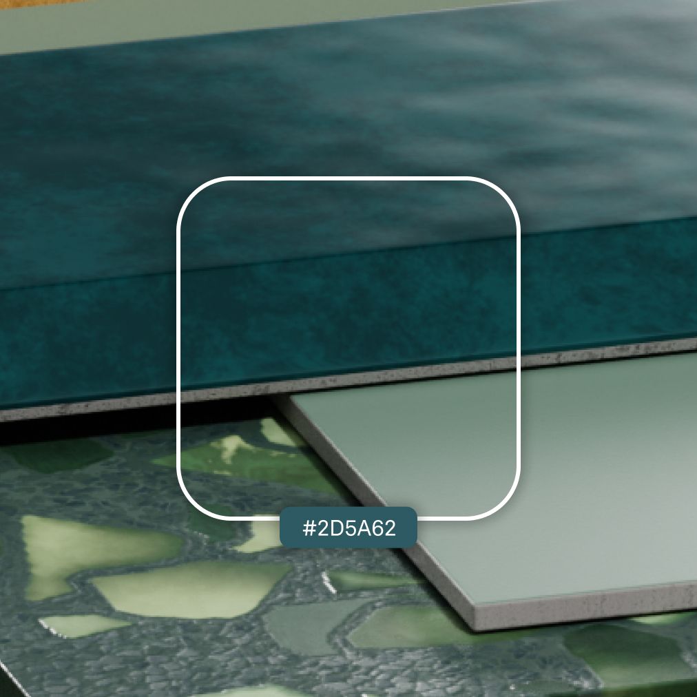
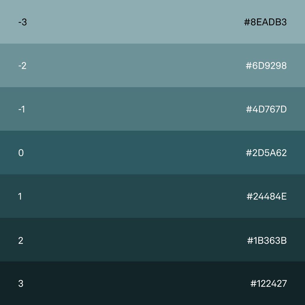
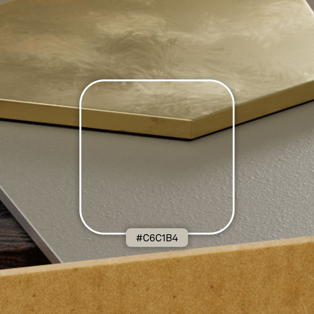
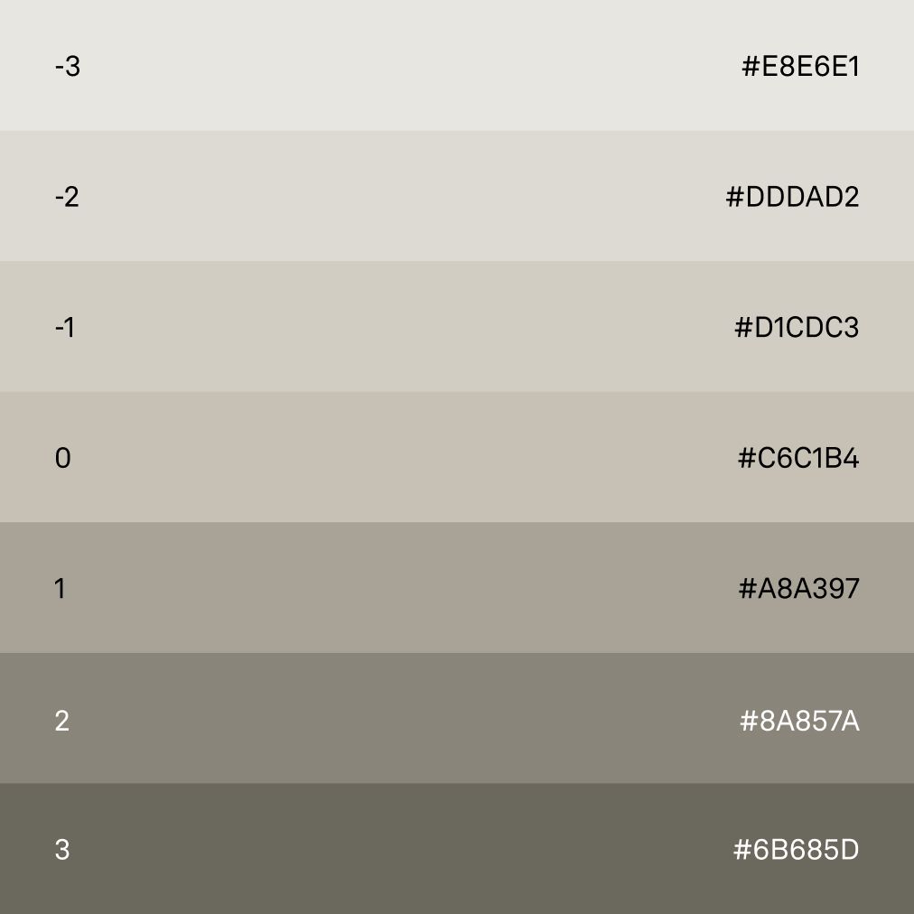
Using colors extracted from materials such as marble, wood, terrazzo, paint, and more can provide a rich and diverse palette for various applications such as advertising, stationery, and more.
Material
Color
Core palette
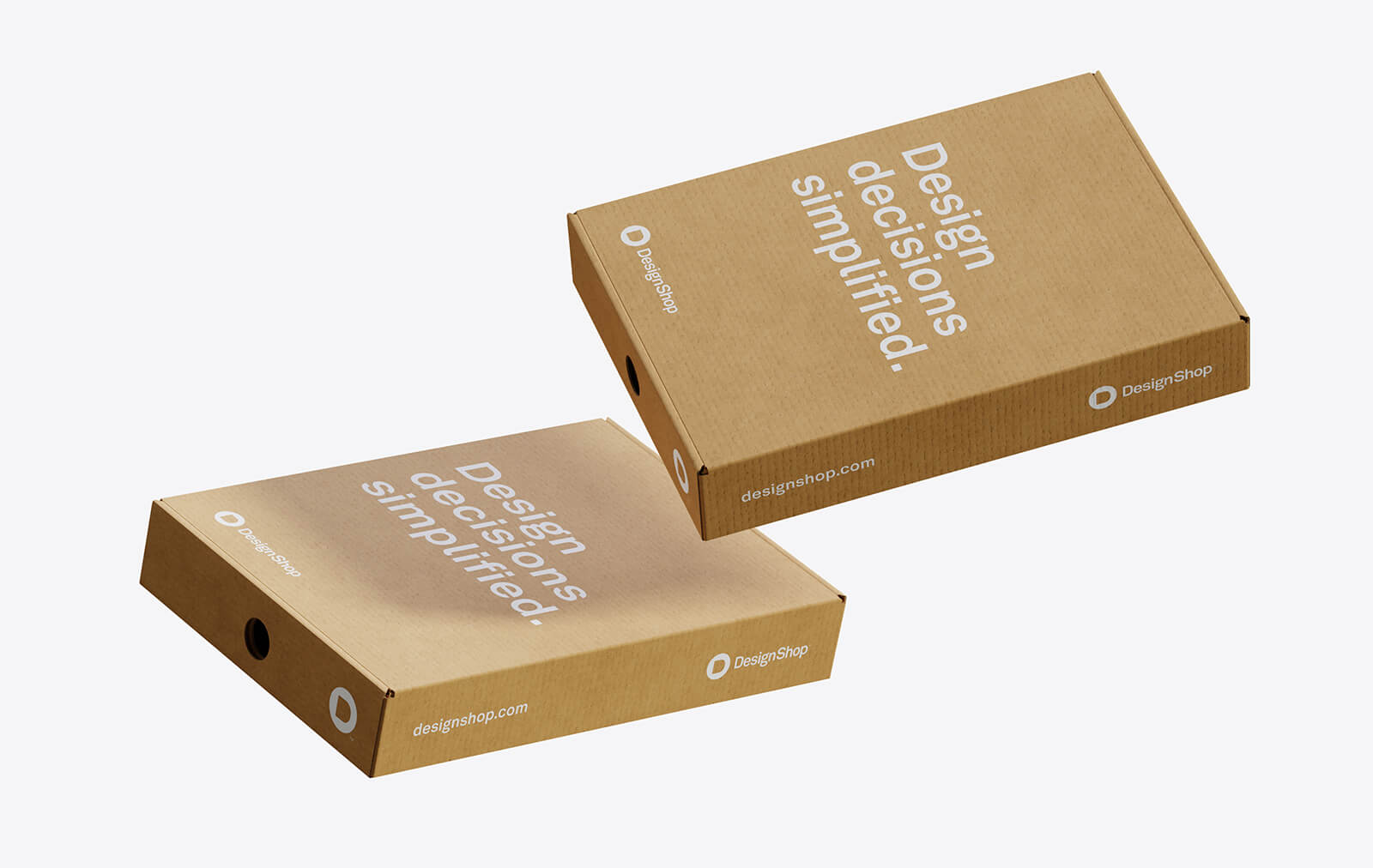
Box
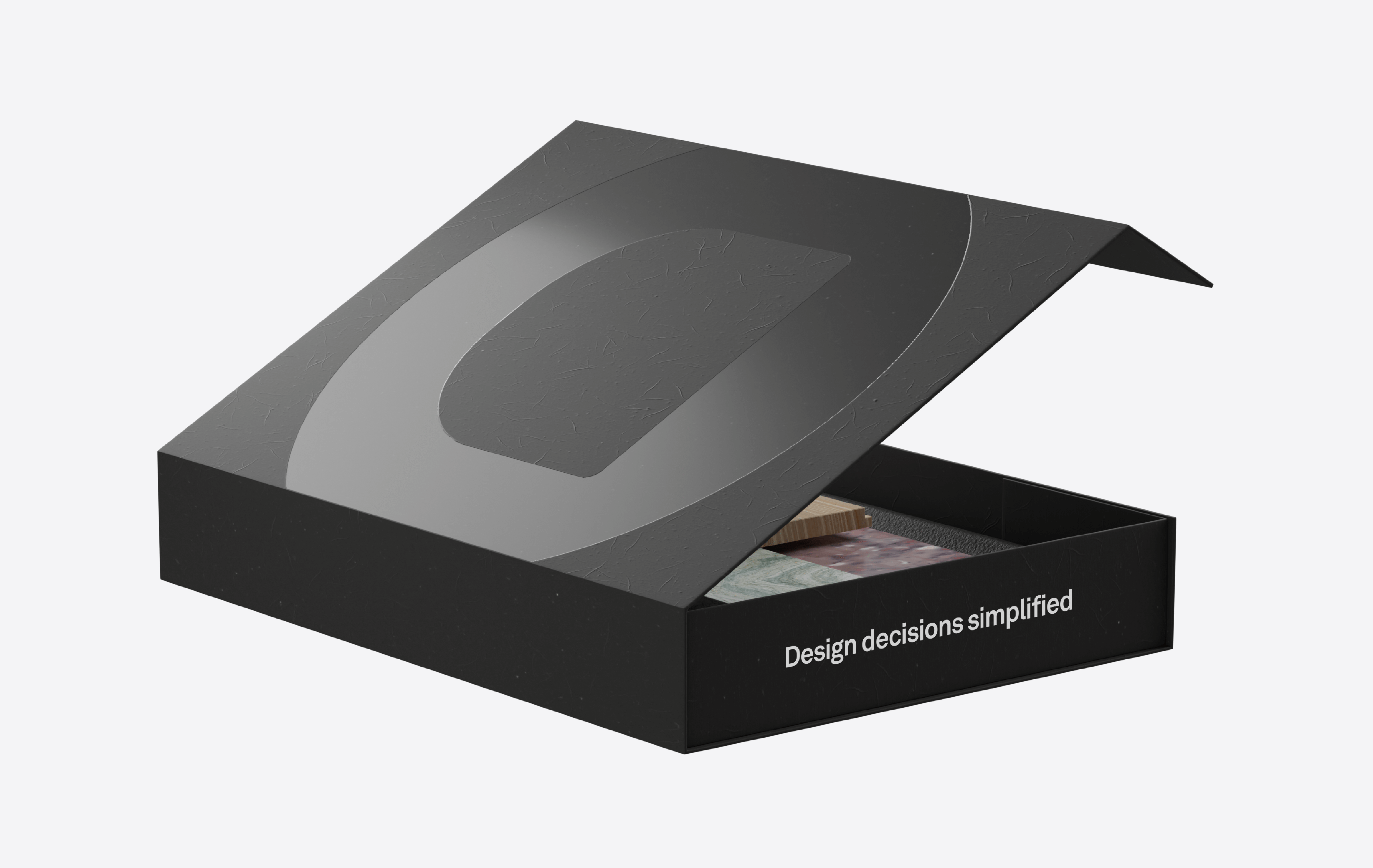
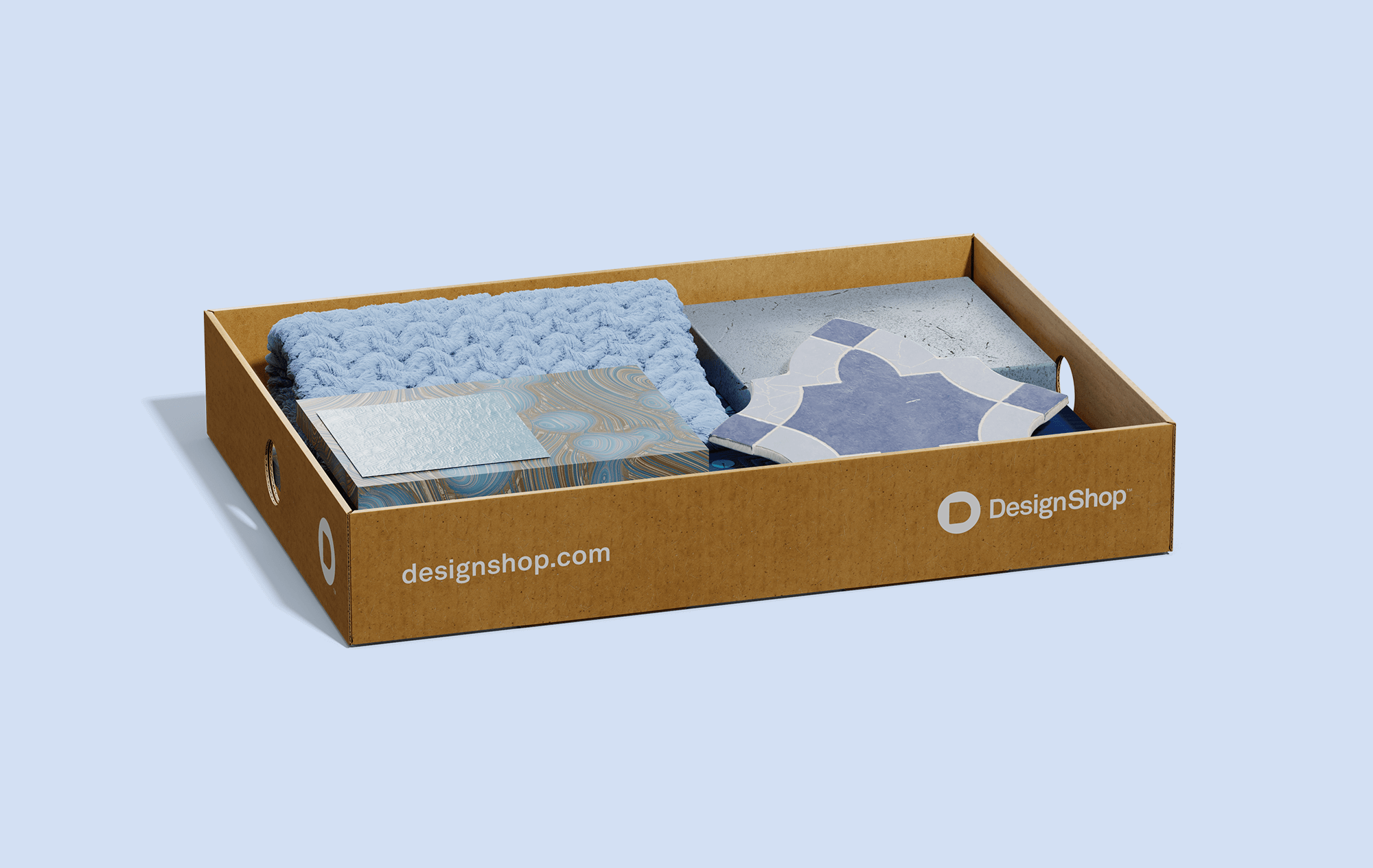
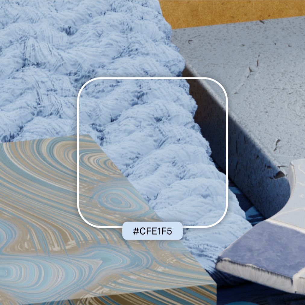
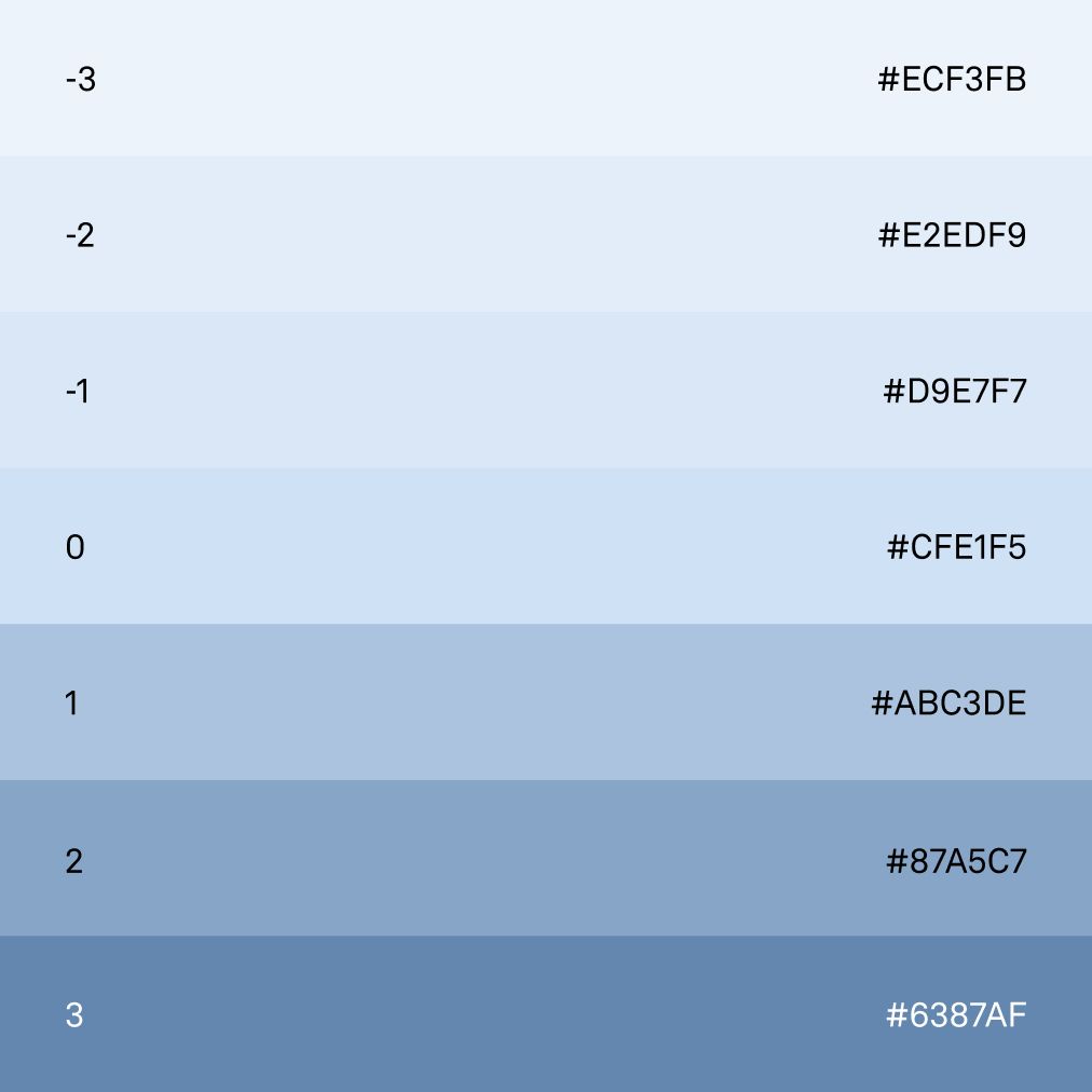
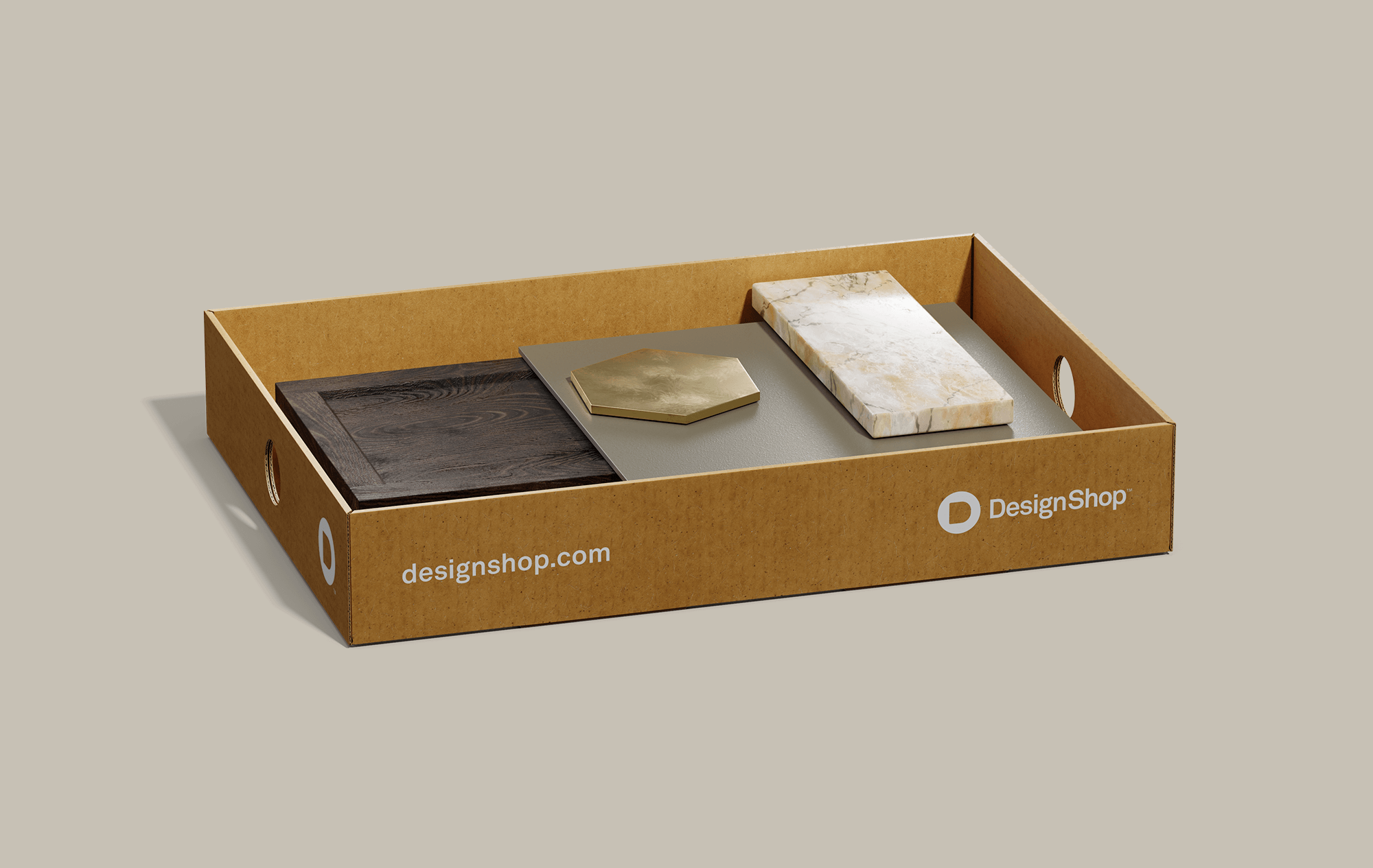
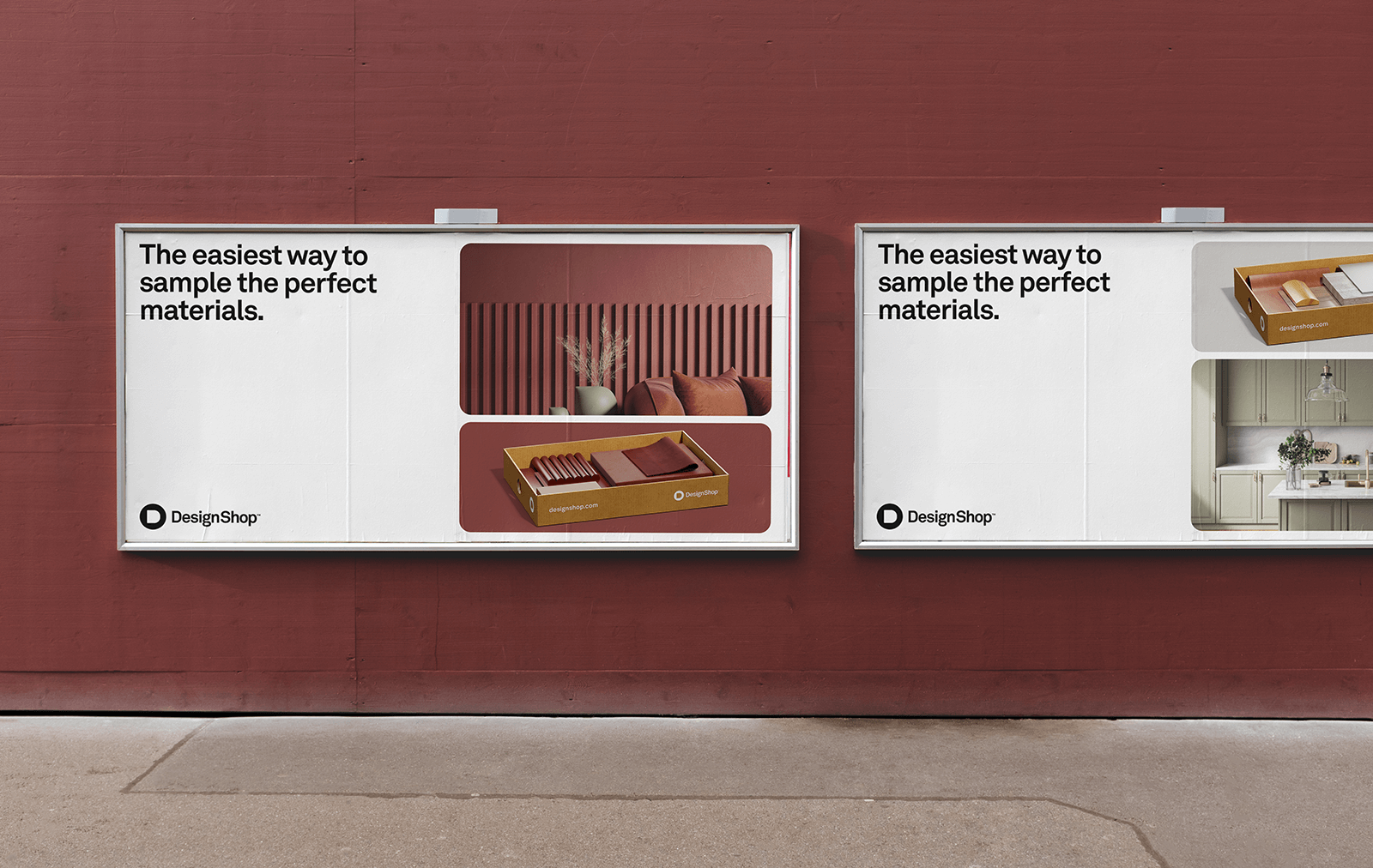
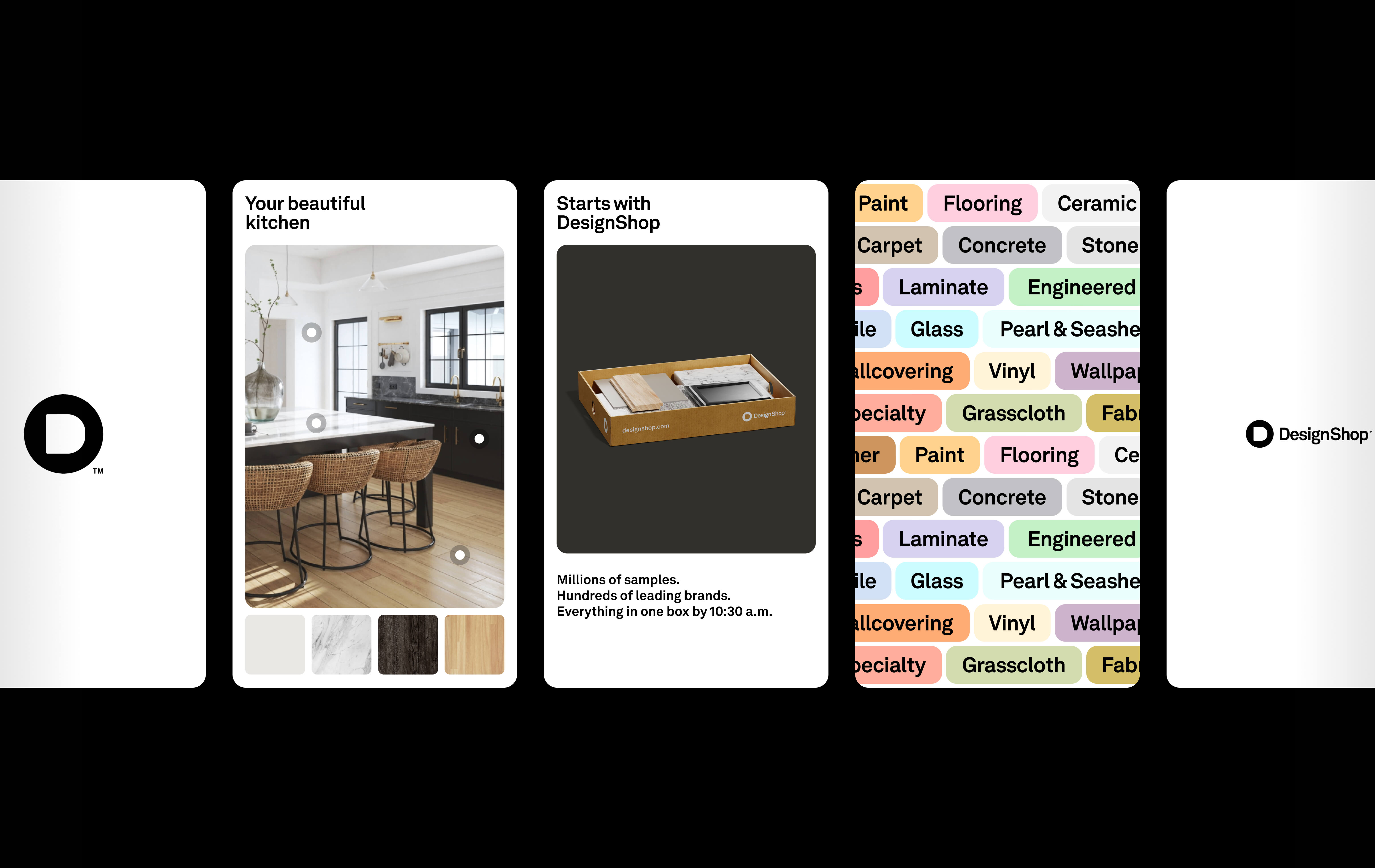
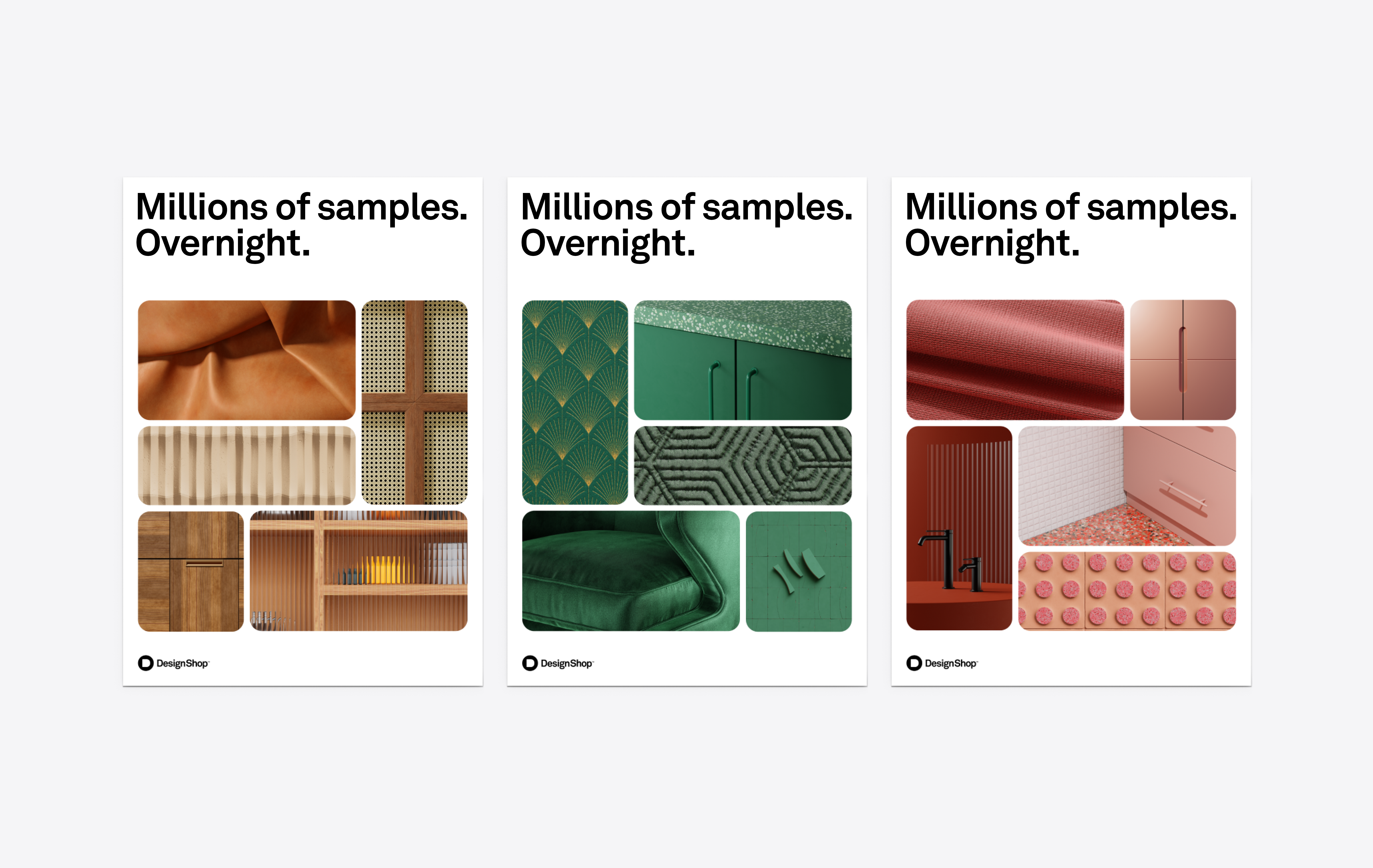
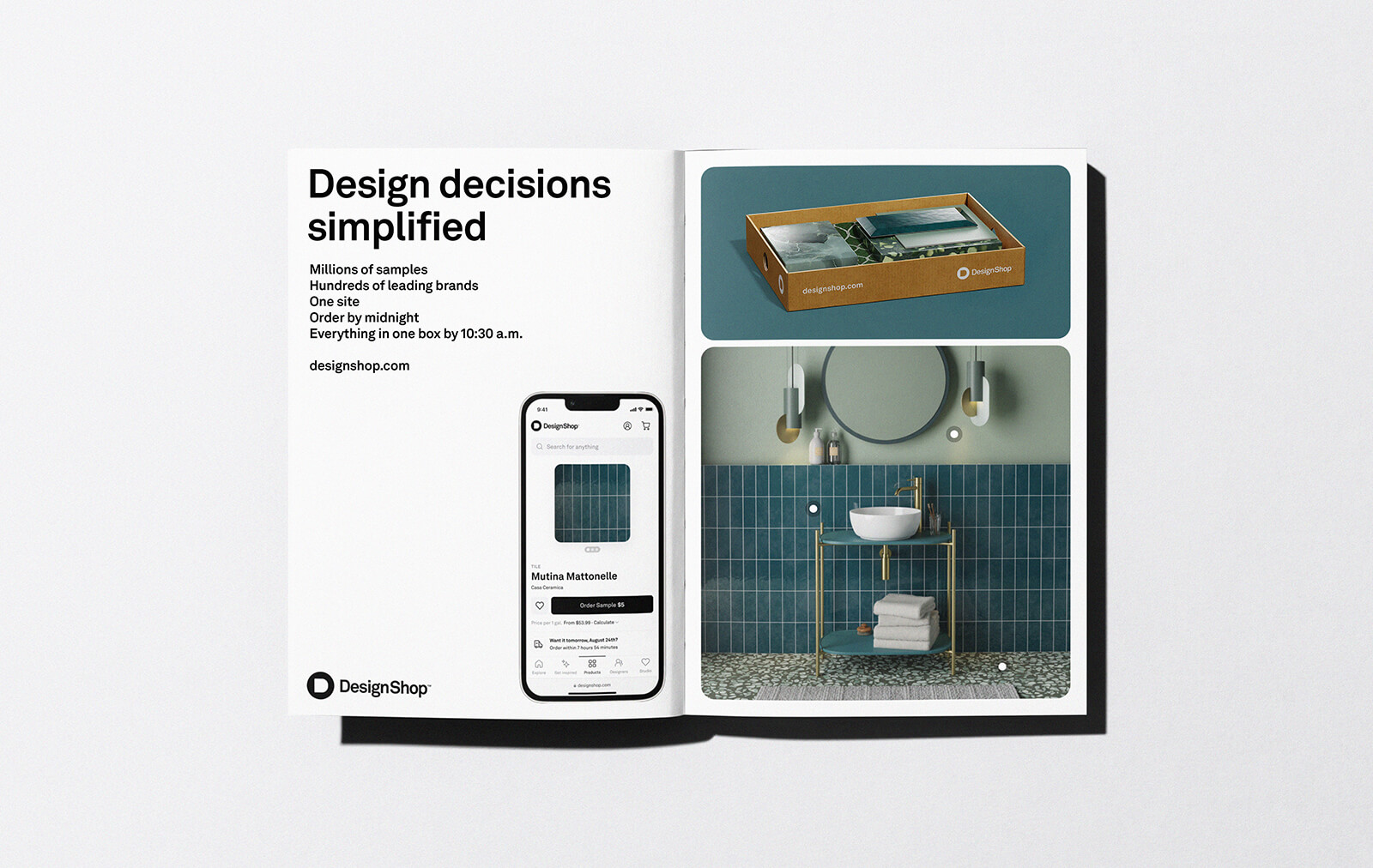
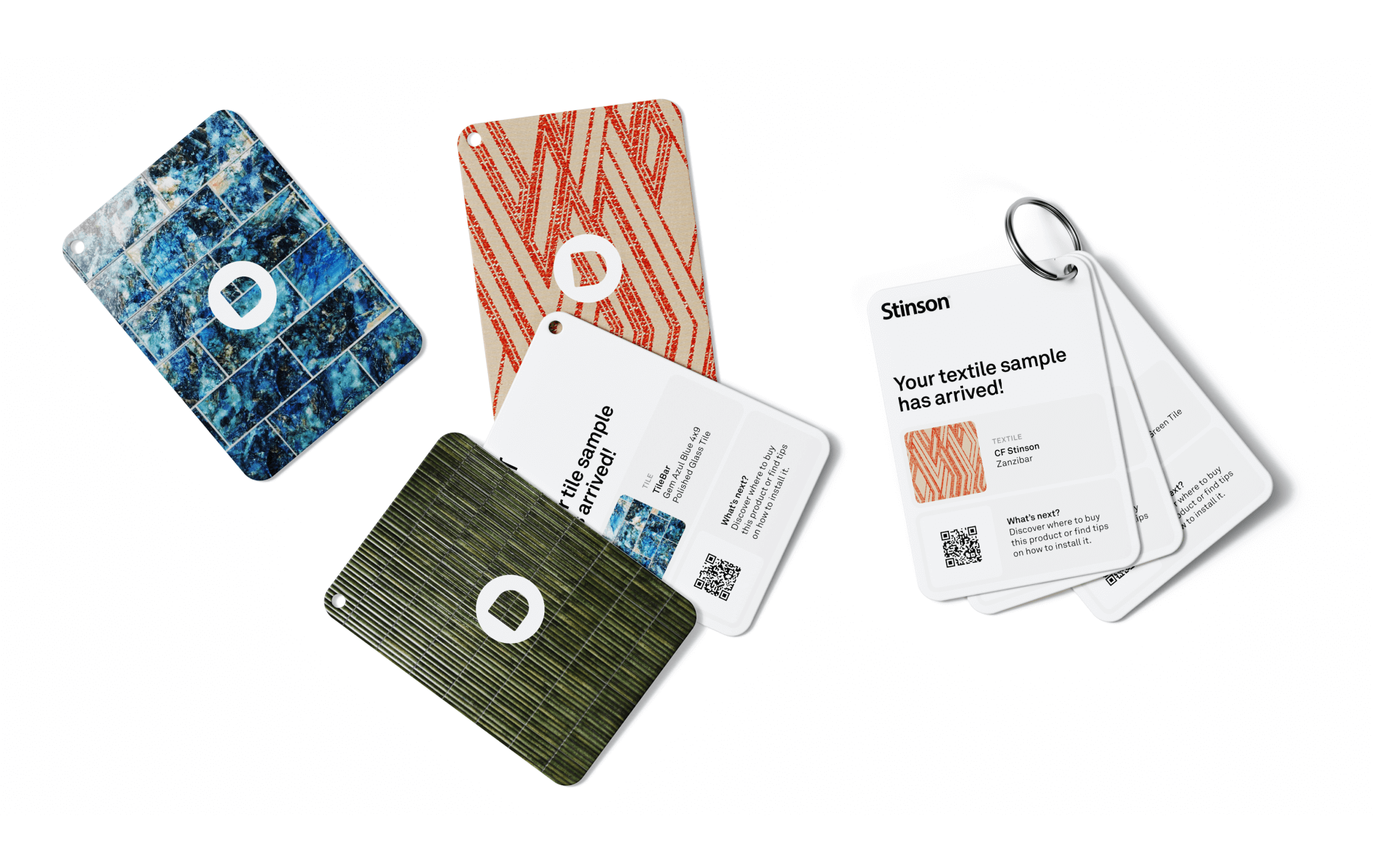
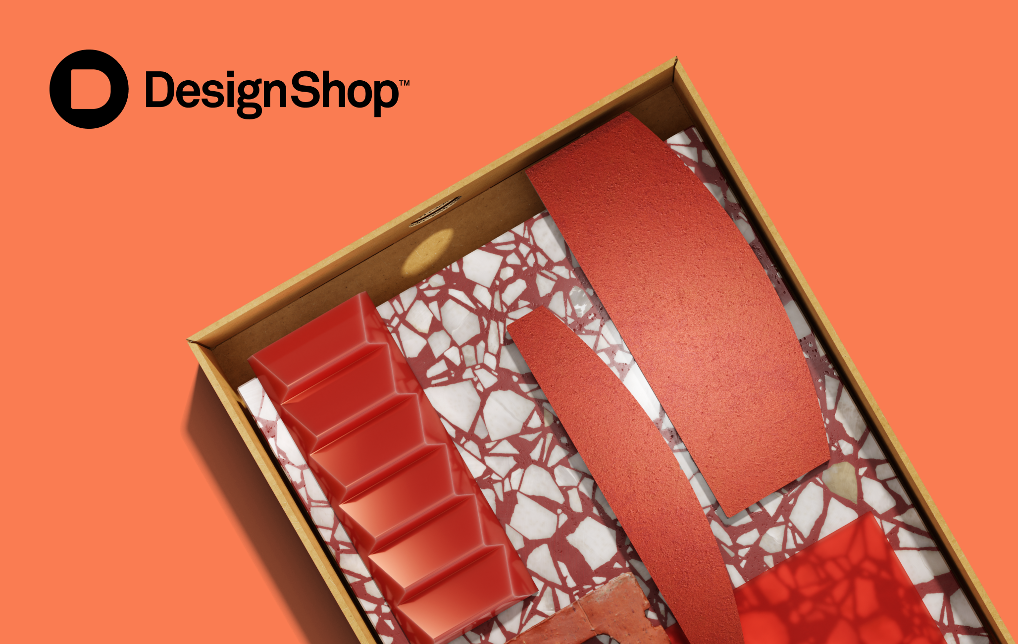
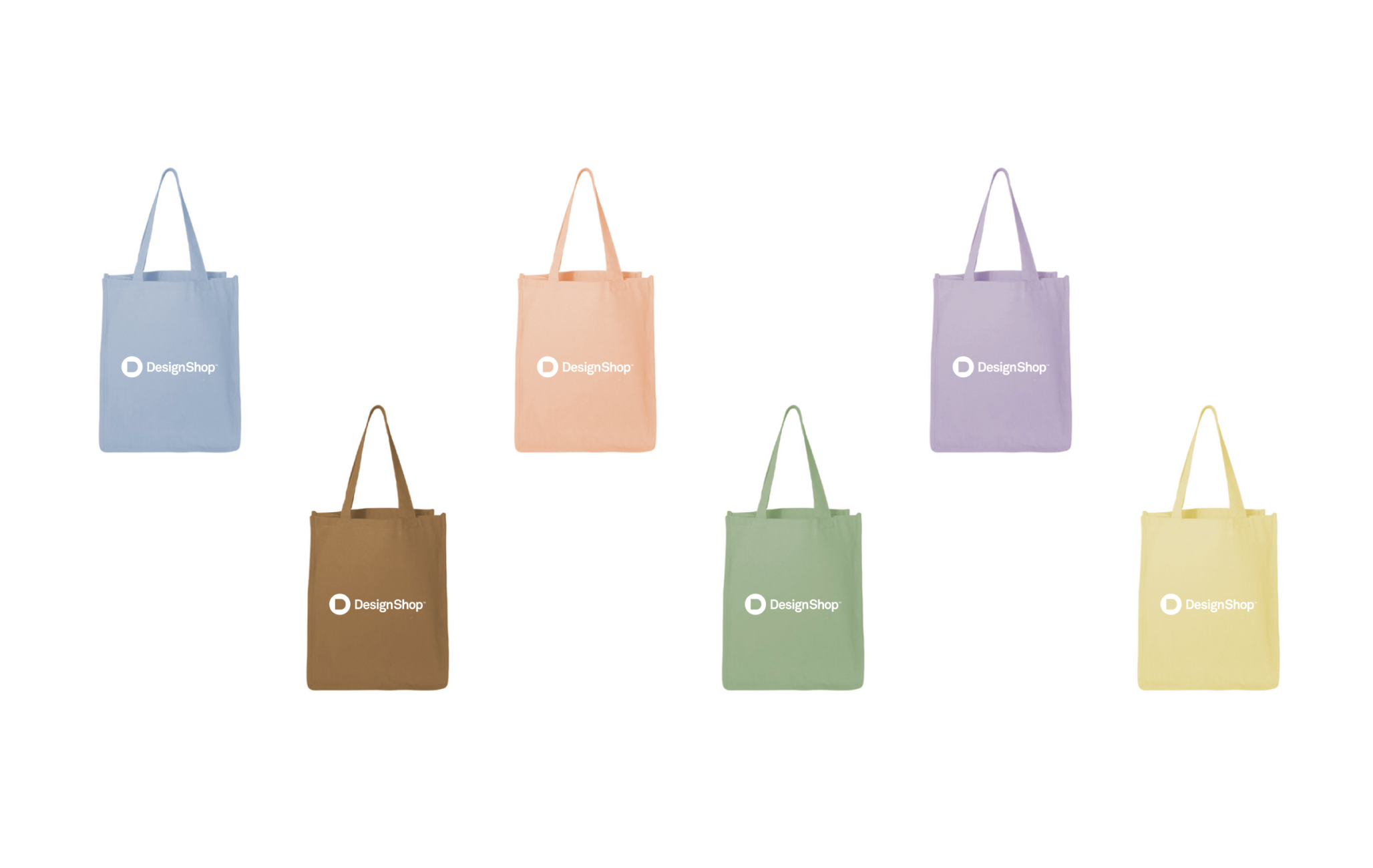
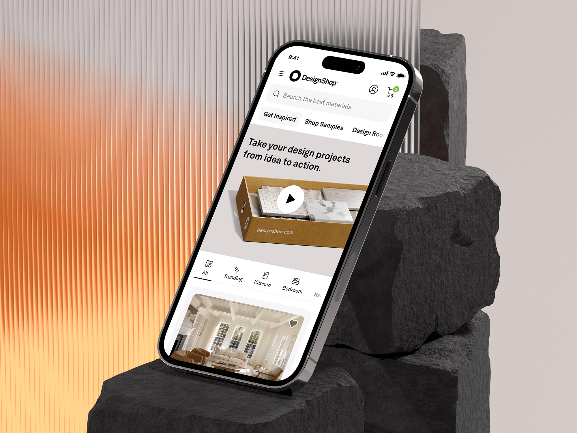
Please refer to the following examples as a guide to ensuring that the visuals displayed on your product screens harmonize with the color palettes found within the DesignShop boxes.
Application examples
Core palette
Type
Our typography is always either black or white, depending on the background of the canvas. Please always choose the text color that provides the best contrast and legibility against the image.
Core palette
Logo
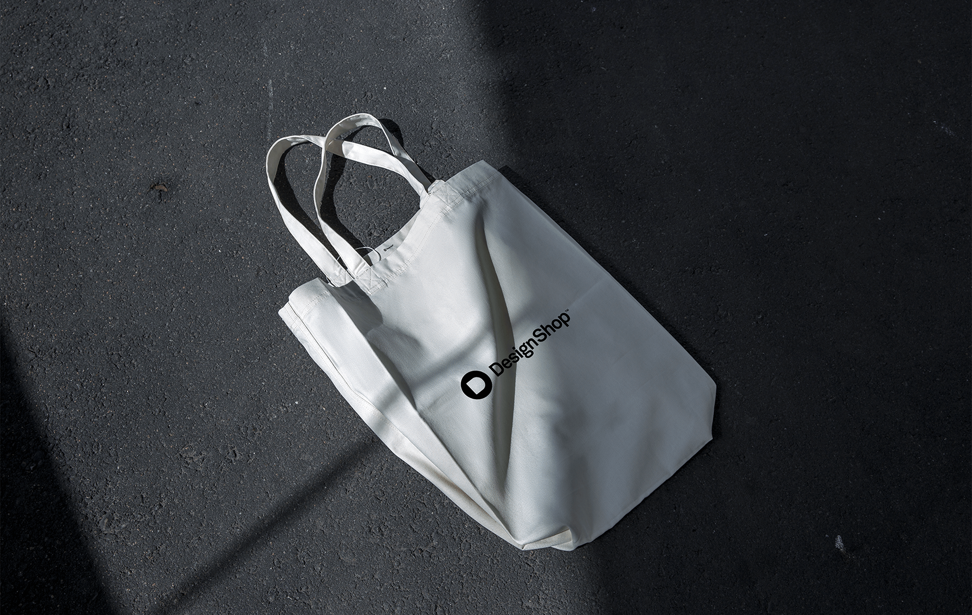
Below are the different color combinations when combining our core palette with the DesignShop logo. Adhering to these combinations will ensure consistency across all formats.





Core palette
Don’ts
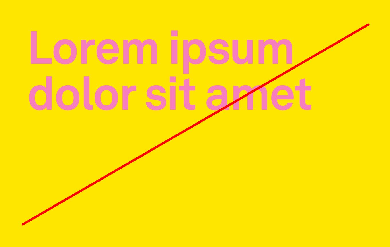
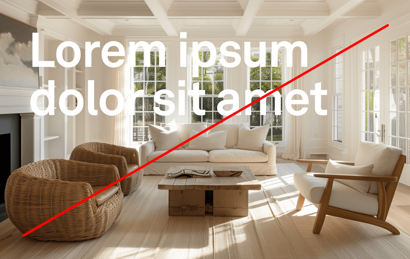
In order to establish a sense of consistency and recognizability across the visual identity, there are certain things that should be avoided when using the core palette.
1. Do not use colored typography.
2. Do not place typography or logos on images that do not create enough contrast for legibility.
3. Do not combine colors with poor contrast.
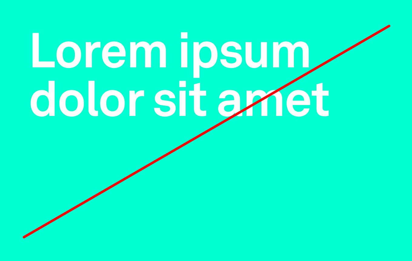
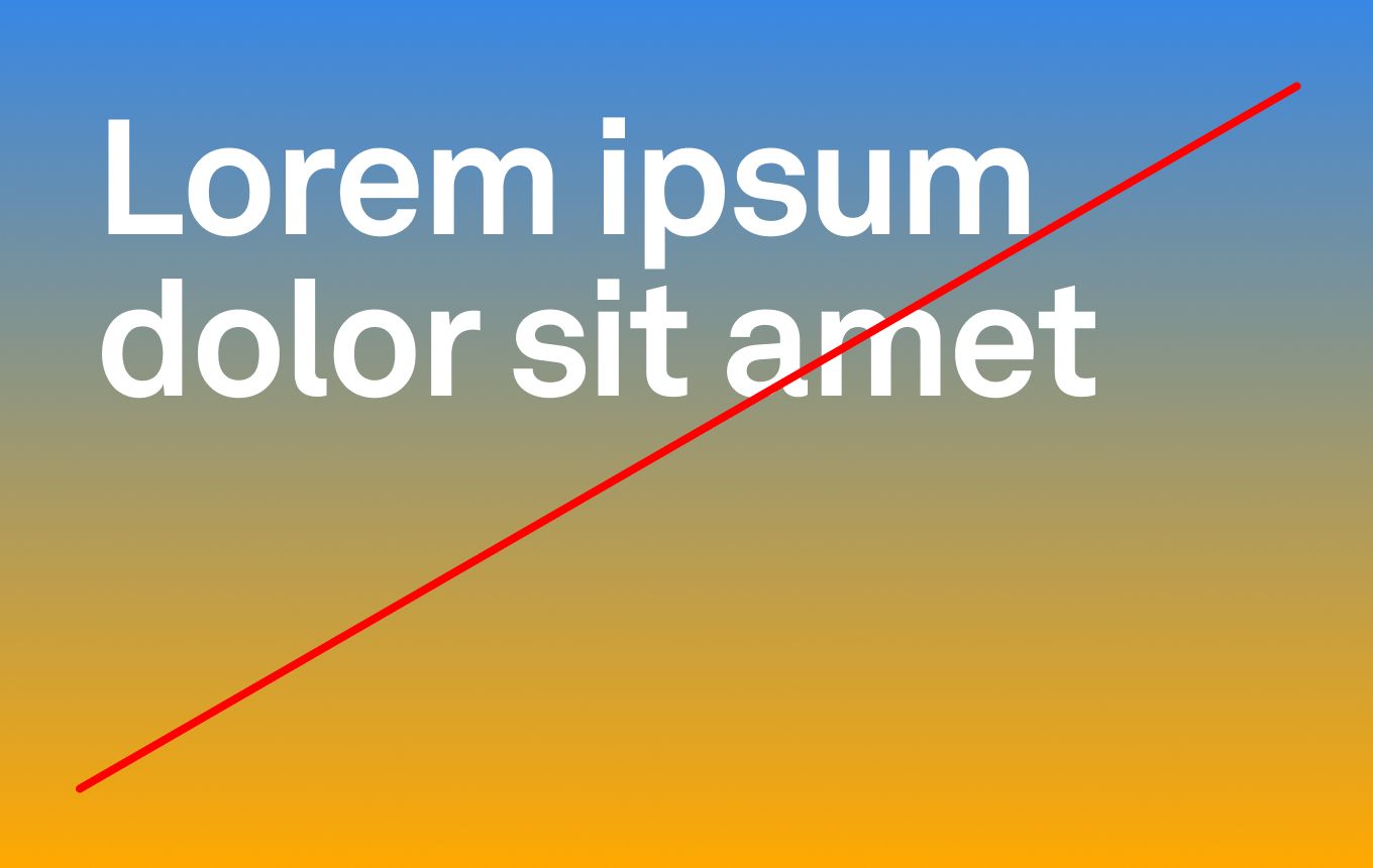
4. Do not use gradients as they are not part of our brand.
Specialty palette
Products
Please refer to the color palette below.
Interface Green
G 198
B 78
M 0
Y 93
K 0
S 60
B 77
HEX #7EC64E
PANTONE TBD
Sustainability Green
G 214
B 44
M 0
Y 100
K 0
S 79
B 83
HEX #45D62C
PANTONE TBD
Purple
G 121
B 244
M 56
Y 0
K 0
S 50
B 95
HEX #B779F4
PANTONE TBD
Red
G 100
B 100
M 76
Y 53
K 0
S 60
B 100
HEX #FF6464
PANTONE TBDt
Contrast
Products
Please refer to the color palette below.
8.45 : 1
WCAG AA: Pass
WCAG AAA: Pass
WCAG AA: Pass
WCAG AAA: Pass
1.66 : 1
WCAG AA: Fail
WCAG AAA: Fail
WCAG AA: Pass
WCAG AAA: Pass